

PROJECT NAME
Marios Pizza Website
CONTENT
Website Redesign
YEAR
Sept 2025 - Dec 2025
PROJECT NAME
Noches To Go Website
CONTENT
Website Redesign
YEAR
Sept 2025 - Dec 2025
PROJECT NAME
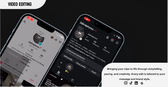
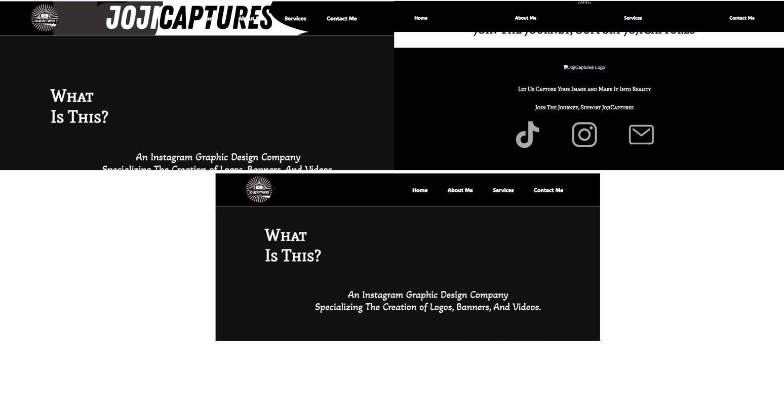
JojiCaptures Service Ad
CONTENT
Digital Service Advertisement
YEAR
Dec 2025
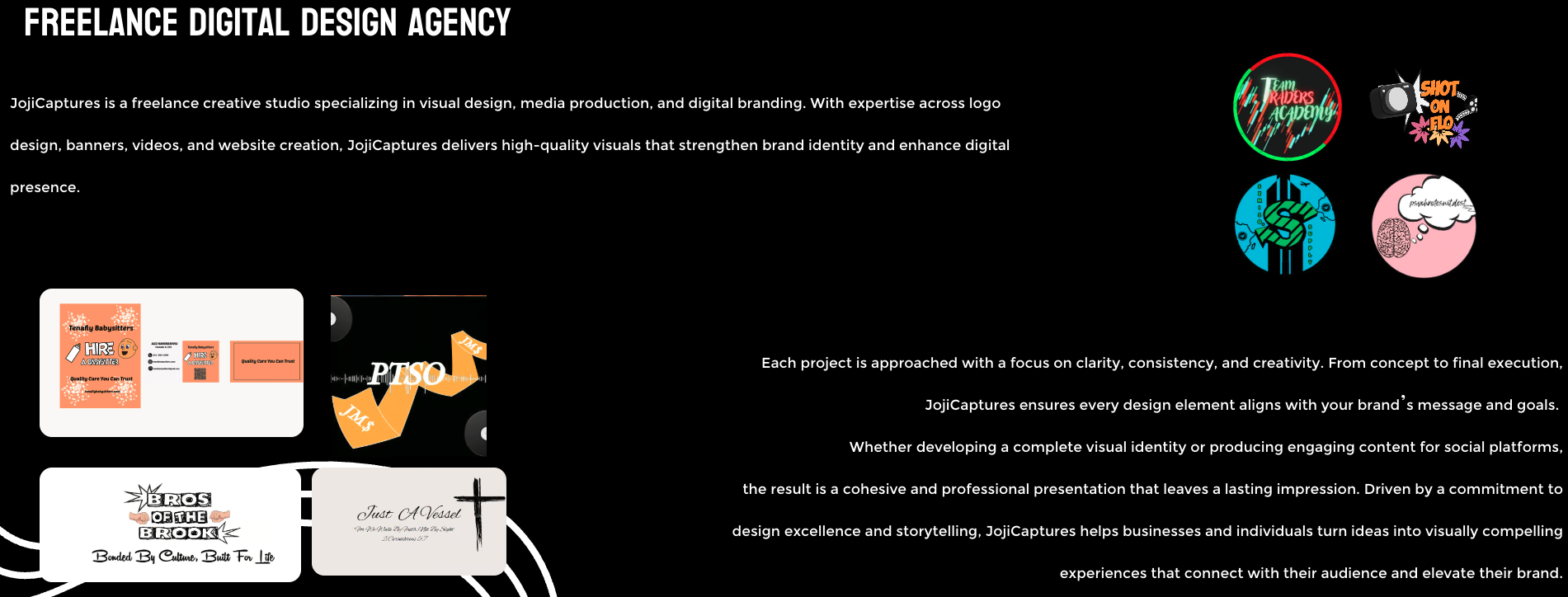
INTRODUCTION
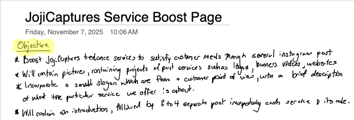
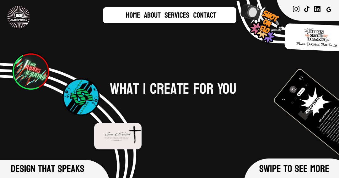
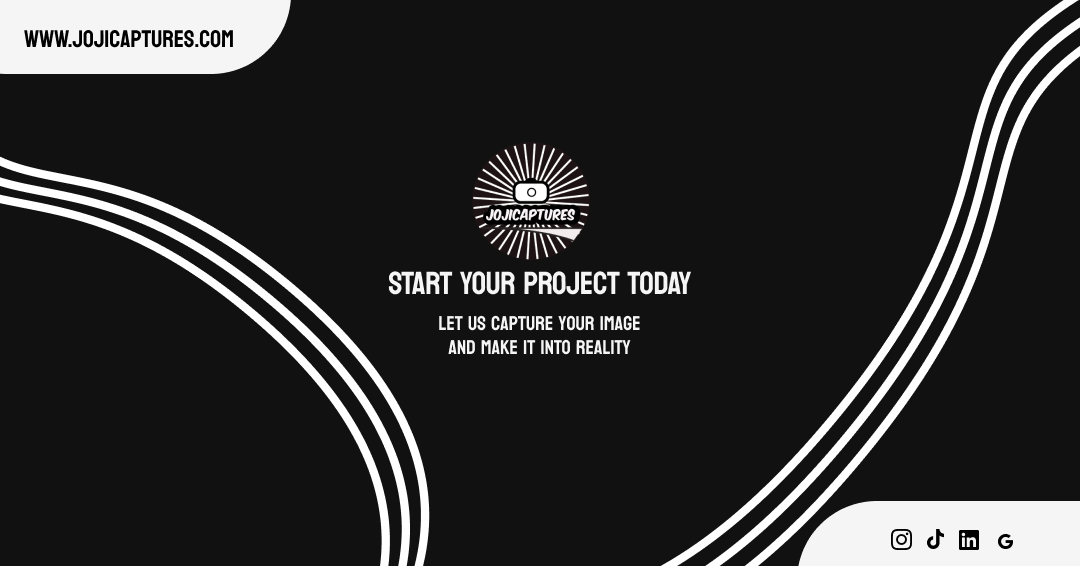
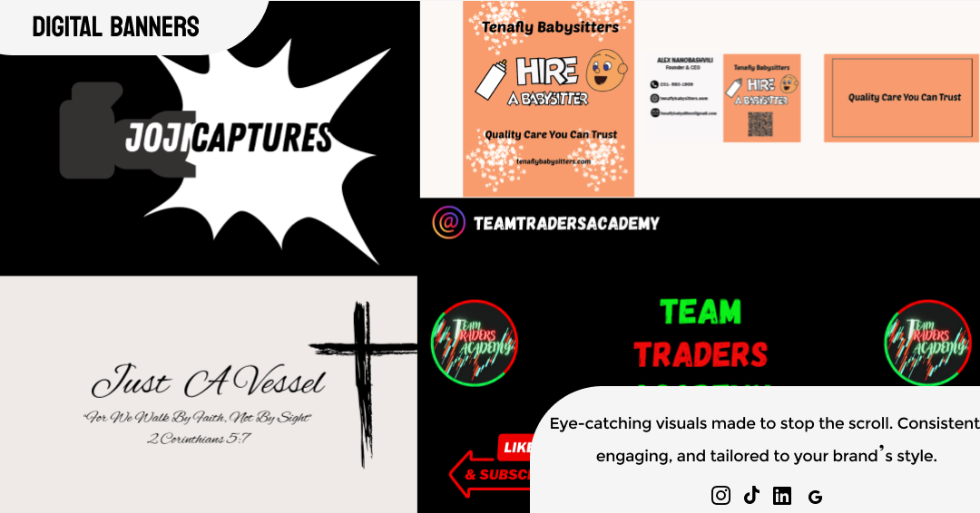
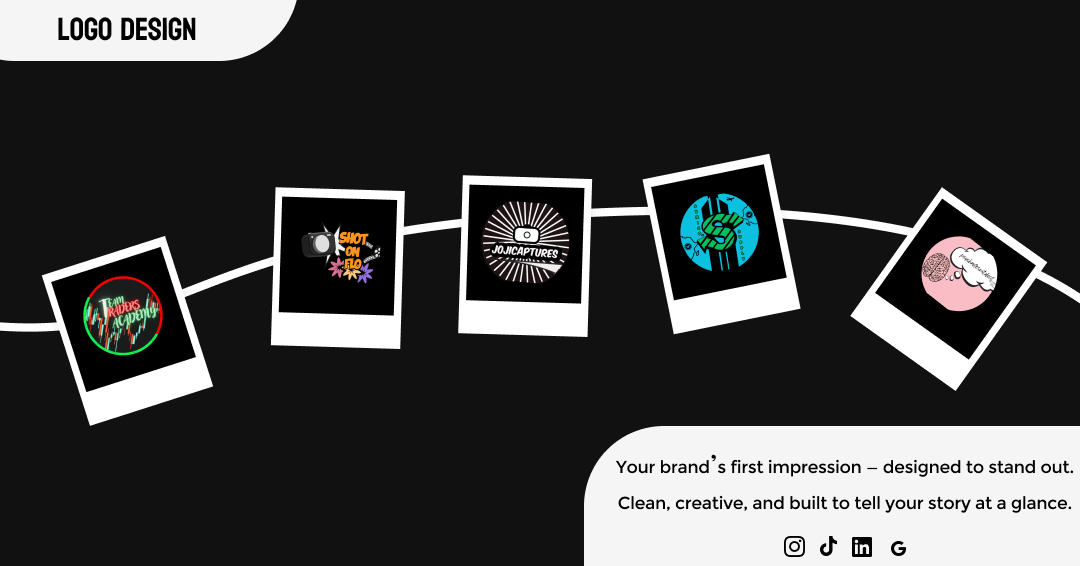
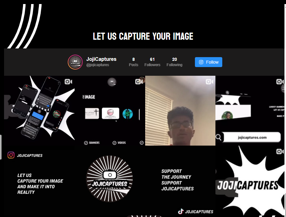
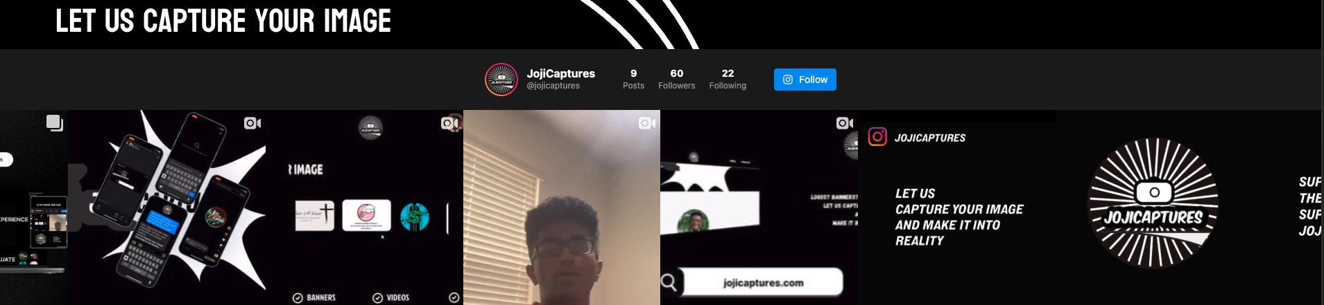
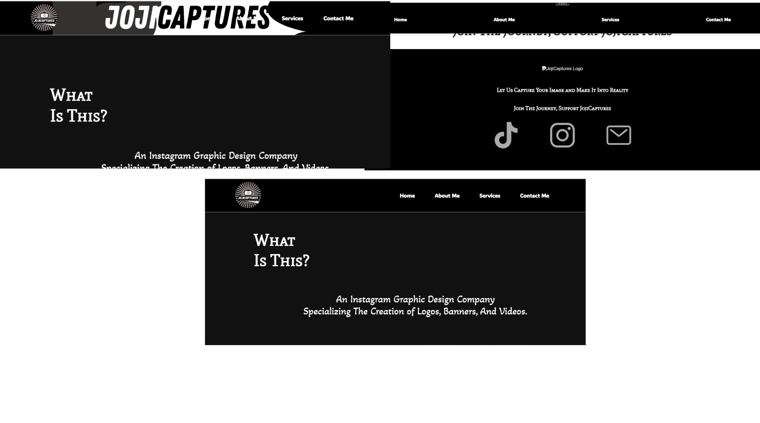
To strengthen JojiCaptures’ freelance identity and attract new collaborations, I designed a service ad banner campaign that visually communicates the creative services offered. The goal was to use clean, engaging visuals—featuring real project work—to build trust, clarify offerings, and increase visibility across digital platforms.
RESEARCH & DISCOVERY
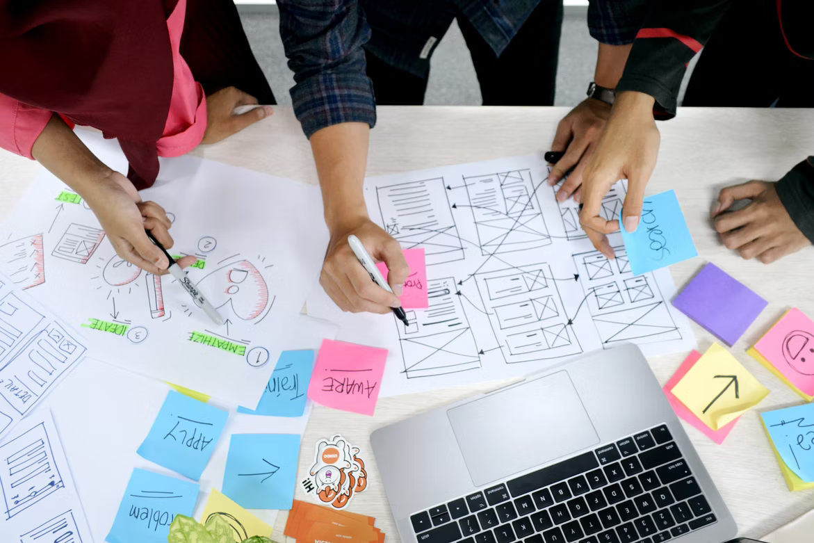
I began by identifying what clients and recruiters value most in service ads: clarity, visual appeal, and immediate understanding of offerings. I studied successful freelance and agency ads across platforms, noting how they used layout, typography, and imagery to communicate value. I mapped out how each JojiCaptures service—logo design, banners, media production, and web design—could be represented through social-media-ready visuals.
INTRODUCTION
To strengthen JojiCaptures’ freelance identity and attract new collaborations, I designed a service ad banner campaign that visually communicates the creative services offered. The goal was to use clean, engaging visuals—featuring real project work—to build trust, clarify offerings, and increase visibility across digital platforms.
DEFINING THE PROBLEM
JojiCaptures lacked a strong visual presence and clear messaging around its services. Potential clients struggled to understand what was offered, and the brand wasn’t gaining traction online. Without a compelling way to showcase capabilities, outreach and engagement remained limited.

- ClIENT ATTRACTION
- VISUAL MEANING
4. ONLINE PRESENCE
3. CORE COMPETENCY
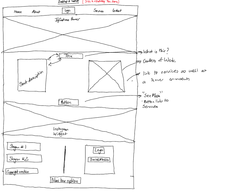
Once the concepts were solidified, I translated the wireframes into high-fidelity digital designs using Figma. This transition enabled precise control over spacing, color, typography, and branding elements, ensuring consistency across all ads. By treating each banner like a social media post, I combined compelling visuals with concise, impactful text to create engaging, easy-to-understand assets optimized for digital platforms.
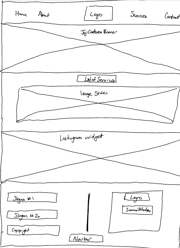
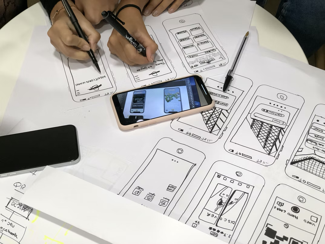
IDEATION & DESIGN PROCESS
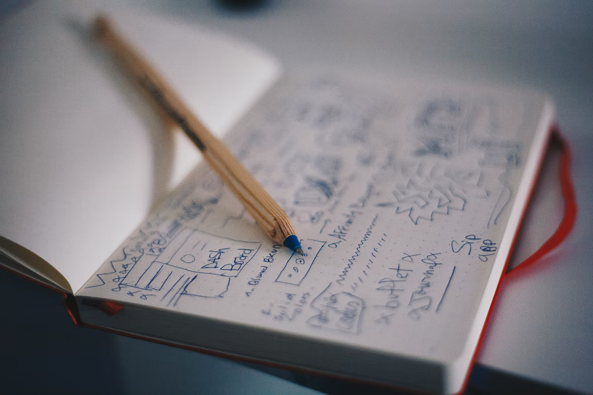
I began the design process by creating hand-drawn wireframes to explore layout, hierarchy, and visual balance. These sketches allowed me to quickly iterate and refine ideas on paper, focusing on clarity and user engagement.
PROTOTYPE & TESTING
High-fidelity prototypes were developed and tested across social media platforms to ensure responsiveness and readability. I refined layouts to ensure images and text flowed naturally, while calls-to-action remained prominent. Feedback confirmed that the banners were visually appealing, clearly communicated services, and aligned with JojiCaptures’ brand.


FINAL SOLUTION & REFLECTION
The final solution now speaks directly to recruiters by clearly presenting the clean, visually engaging ad banners that effectively communicated JojiCaptures’ services through real project imagery and consistent branding. This design significantly boosted client attraction and collaboration opportunities, enhancing JojiCaptures’ visibility and credibility in a competitive market. The project demonstrated how strategic design directly drives business growth by improving brand clarity and engagement.
I learned that my skills in user-centered design, visual hierarchy, and digital marketing enable me to craft compelling communication that effectively attracts and retains clients, making me a valuable asset in helping businesses succeed in today’s competitive economy. This case study highlights my ability to combine empathy, design strategy, and platform awareness to create impactful solutions that advance both the business and its clients.
TikTok
INTRODUCTION
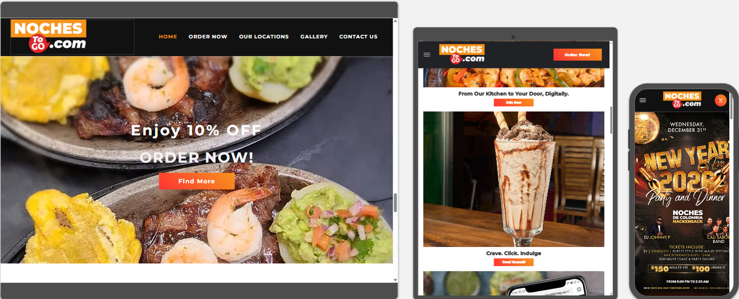
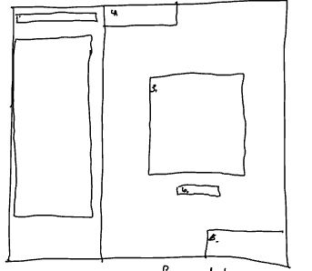
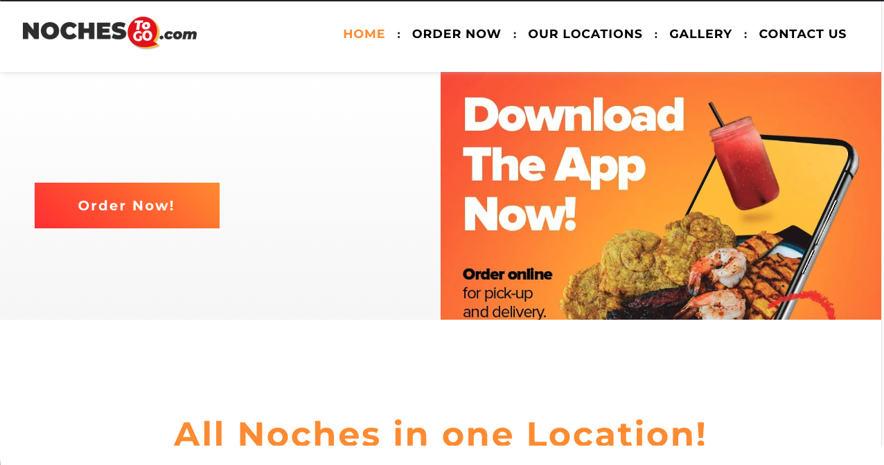
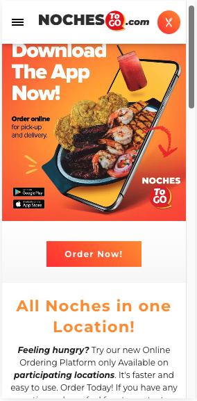
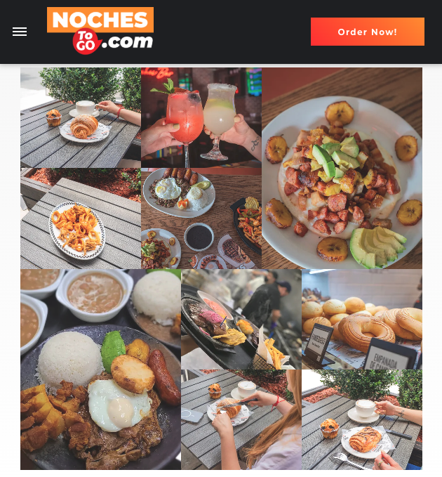
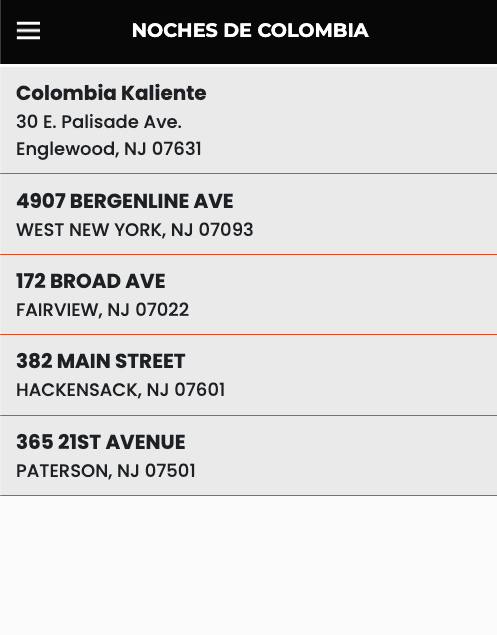
During my internship as a Web Designer at SKY Marketing LLC, I was tasked to redesign Noches To Go, a centralized online ordering platform for multiple Noches de Colombia locations across New Jersey. The goal was to create a responsive, modern website that allowed users to browse menus, select their preferred location, and place orders seamlessly through our ordering platform, SKY Digital Ordering. The redesign needed to elevate the brand’s digital presence, reflect its cultural identity, and deliver an app‑like experience that felt intuitive, fast, and visually engaging.

DEFINING THE PROBLEM
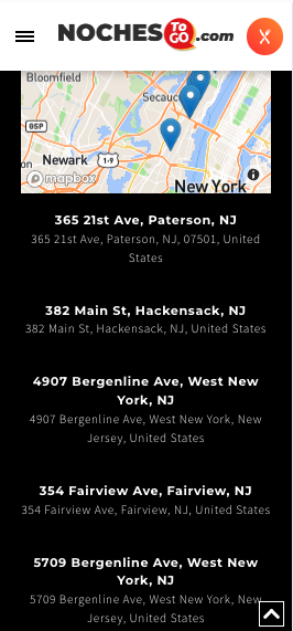
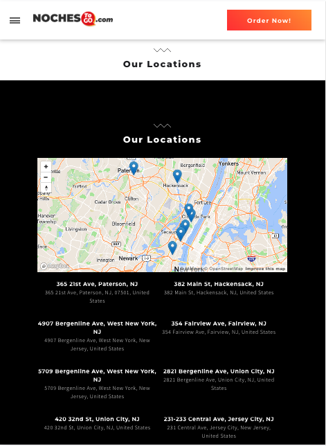
The original Noches To Go website lacked structure, clarity, and essential information, resulting in a weak user experience. It had a bland visual layout, minimal brand identity, and missing details about restaurant locations, services, and partner restaurants. The site also lacked emotional appeal due to limited photography and had poor visual hierarchy, making navigation unclear. The redesign needed to transform the platform into a structured, informative, and visually compelling experience for customers
RESEARCH & DISCOVERY
To begin the project, I met with my boss, Jason, to identify the improvements needed, with the main priority being to enhance the user experience and make the site feel more like a dedicated ordering app. I conducted competitive research by studying well‑known restaurant websites and analyzing how they used typography, visual hierarchy, photography, videography, and layout to guide user behavior. This research helped me understand how successful platforms structure content to improve user flow, reduce friction, and encourage ordering, ultimately shaping the design direction for Noches To Go.

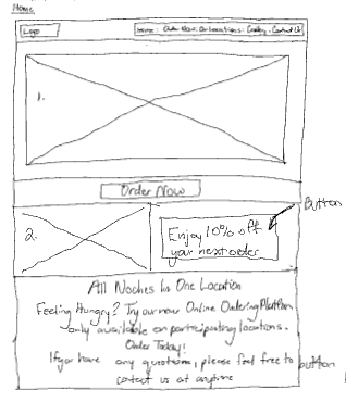
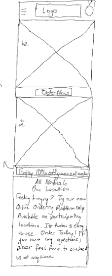
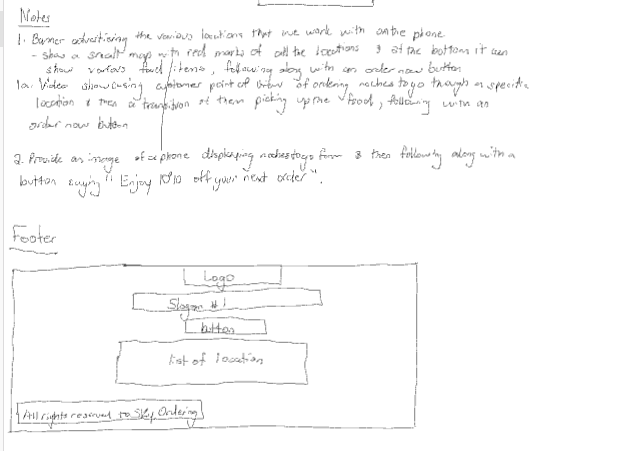
I began by creating wireframes for each page, mapping out the header, footer, image placement, typography hierarchy, button layout, and location sections.
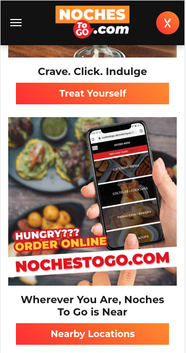
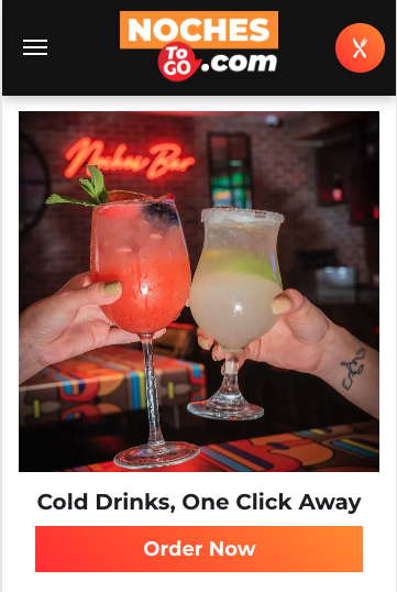
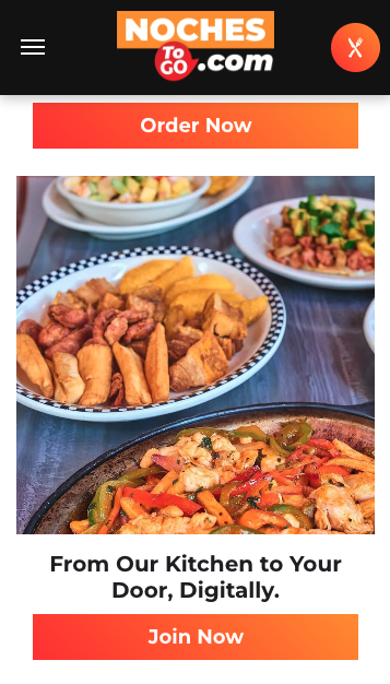
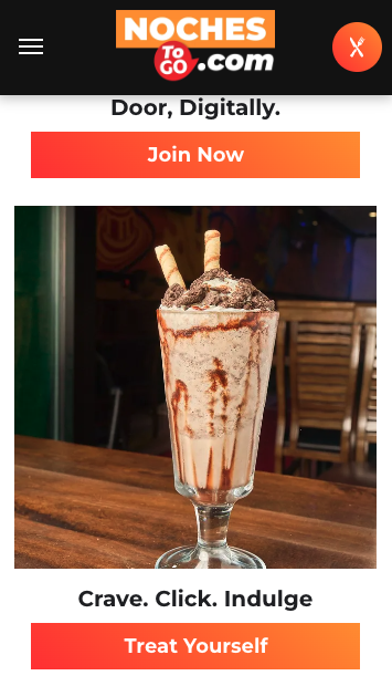
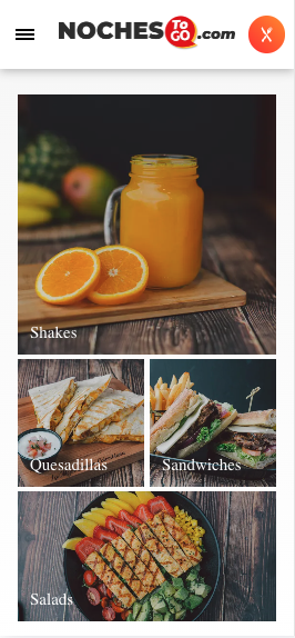
I moved into high‑fidelity prototyping through Duda and incorporated brand colors, food photography, videography, and interactive buttons linking to SKY Ordering. I applied HCI principles ( Human Computer Interaction)—especially emotional design—by including photos of real customers dining, being served, and enjoying meals at various locations to build trust and authenticity. The design emphasized clarity, responsiveness, human emotion, and visual hierarchy to guide users through the site in a natural, intuitive way.
IDEATION & DESIGN PROCESS
PROTOTYPE & TESTING
Once the prototype was complete, I conducted extensive testing across desktop, tablet, and mobile devices to ensure a smooth, app‑like experience. I evaluated navigation flow, button visibility, page load speed, ordering link functionality, and readability without disrupting the user journey.

FINAL SOLUTION & REFLECTION
The final Noches To Go website brought together a clean, modern, and cohesive digital presence that made ordering simple across multiple restaurant locations. I focused on intuitive navigation, strong visual hierarchy, and clear “Order Now” pathways, supported by a fully responsive layout that aligned with real user behavior—mobile users accounted for 87% of all visits and 86% of page views, making mobile‑first design essential to the platform’s success.
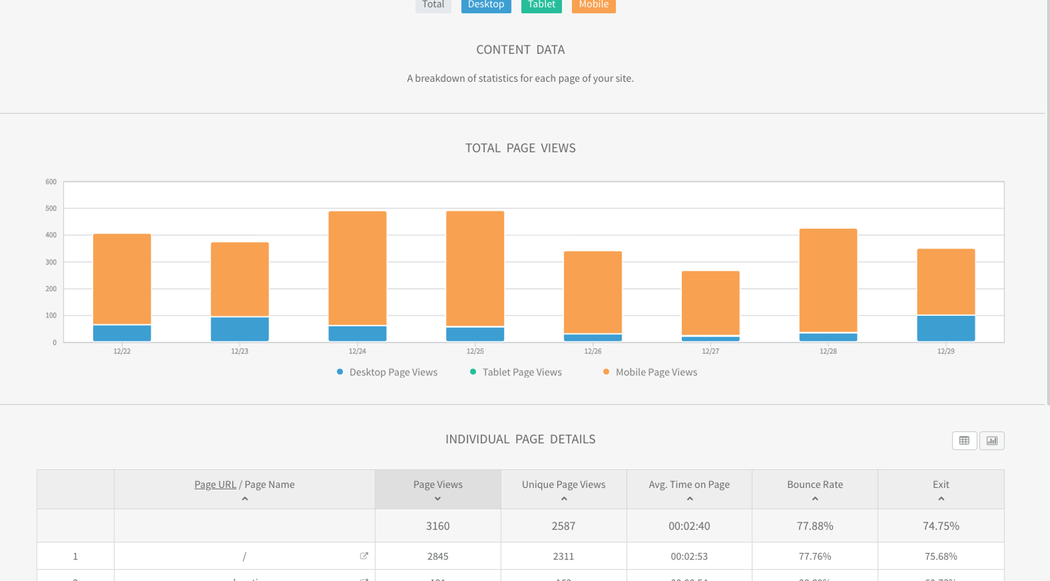
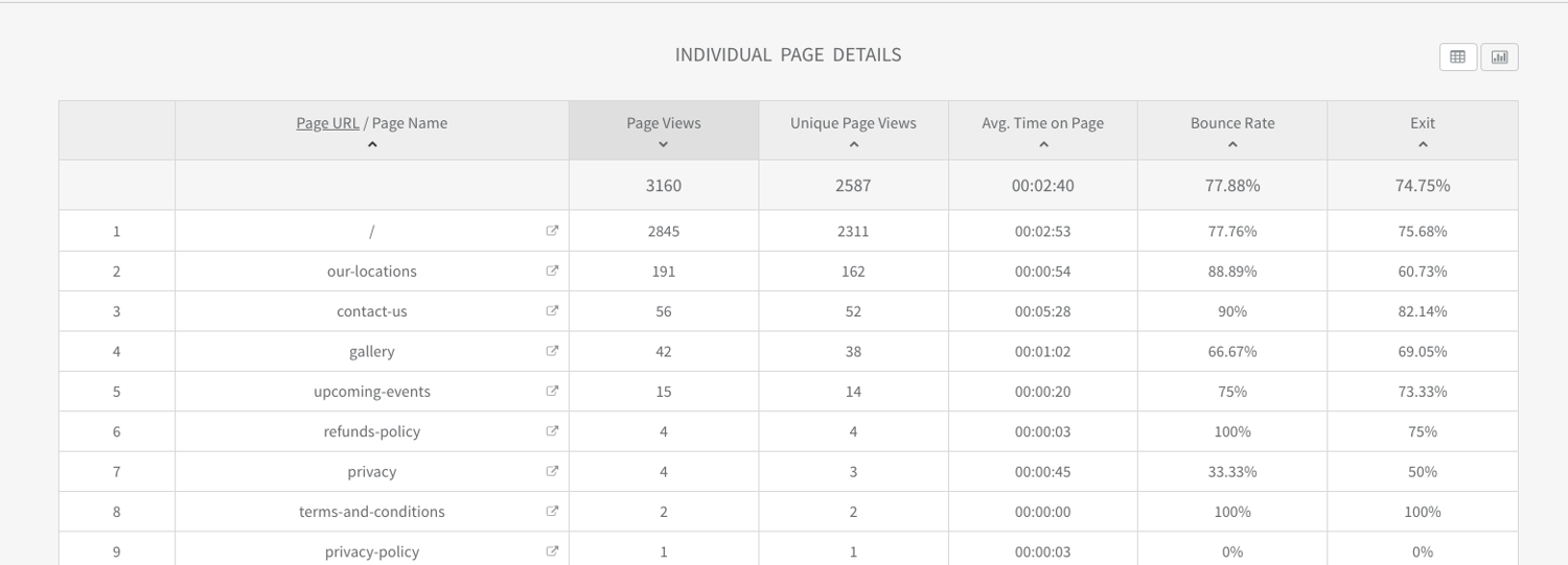
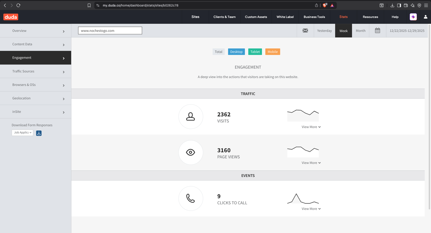
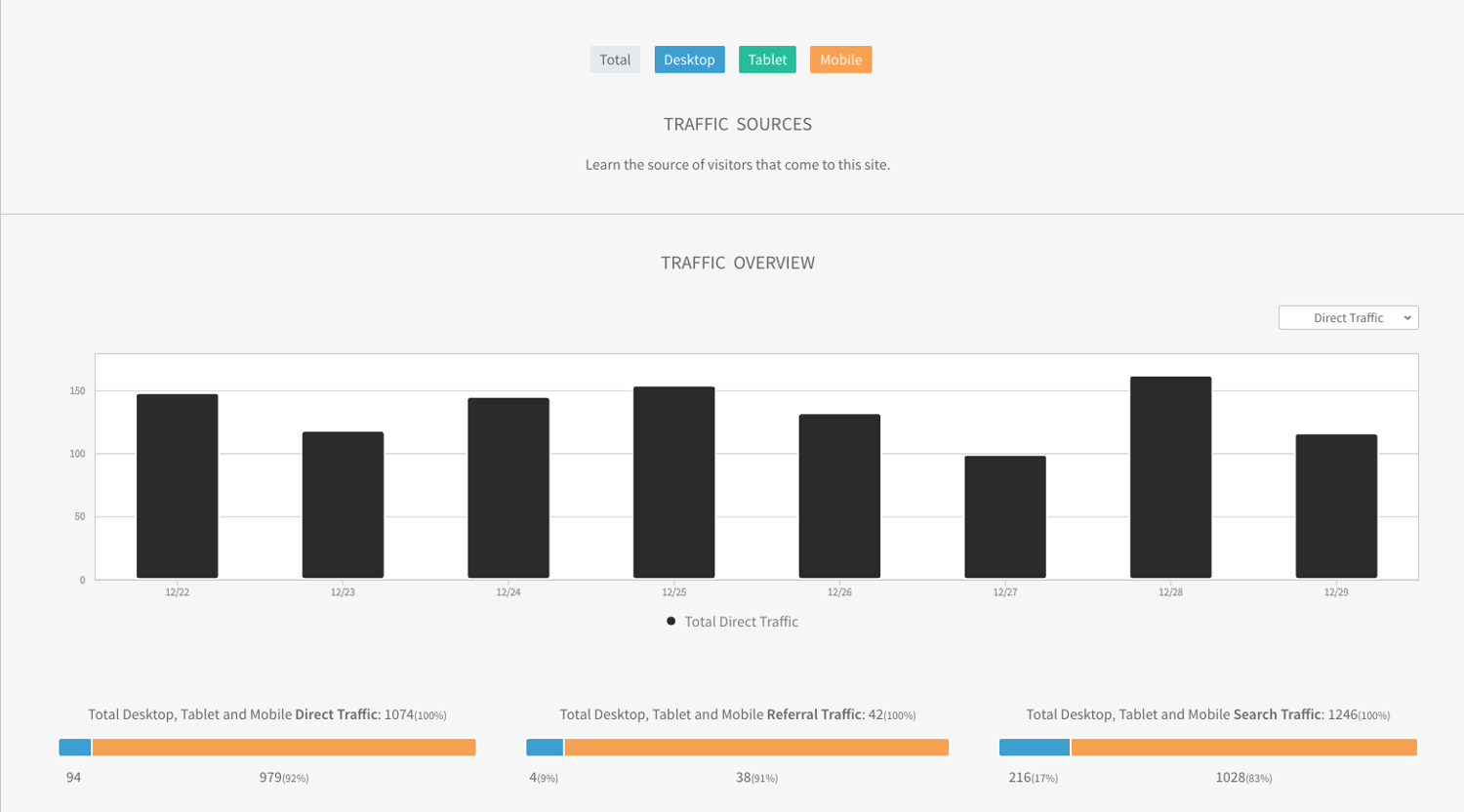
As you review this case study, you’ll see how the redesign translated directly into stronger engagement. The homepage reached 3160 views with an average time on page of 2 minutes and 40 seconds, while the “Our Locations” page saw 2845 views with similarly strong engagement. Internal navigation performed especially well, generating 415 page views with a bounce rate of just 20.22%, compared to over 55% on search traffic and 61% on direct traffic. Across the week, users generated 2362 total visits, 3160 page views, 9 click‑to‑call interactions, and more than 2400 newsletter impressions—clear signs that the refined layout and interaction patterns encouraged deeper exploration and more meaningful actions.
This project strengthened my ability to design scalable, multi‑location systems and translate business goals into user‑centered digital experiences. And this is exactly where I can support you: by simplifying complex flows, improving conversion through thoughtful UX, and building digital platforms that help your business grow. Whether you’re expanding an ordering system, improving customer engagement, or elevating a brand’s online presence, I bring a design approach that creates experiences users love—and delivers measurable results that move your business forward.
View Website
INTRODUCTION
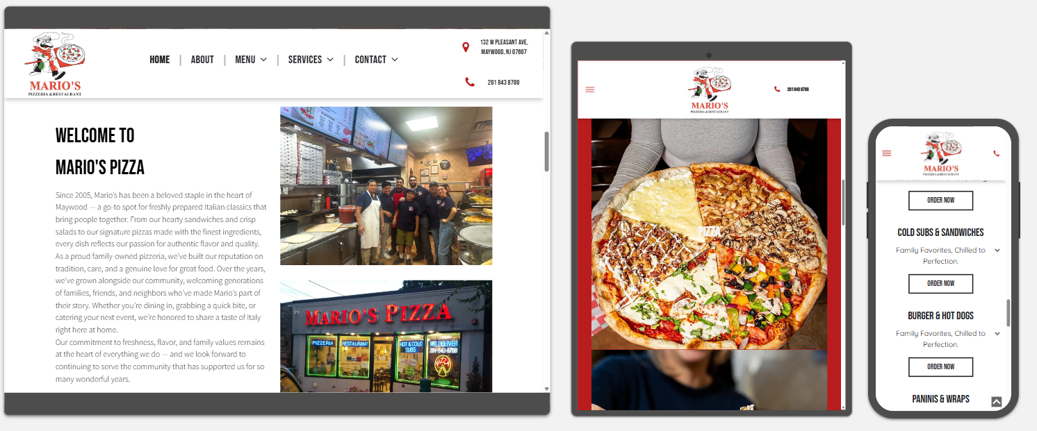
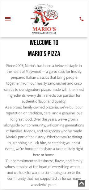
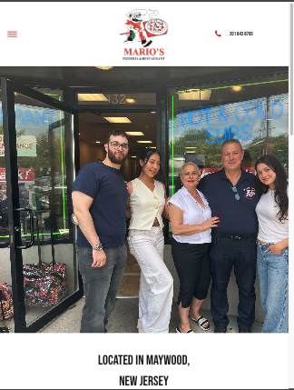
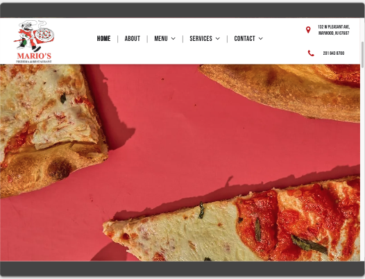
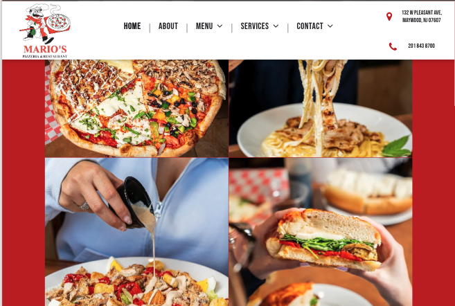
During my internship as a Web Designer at SKY Marketing LLC, I was asked to redesign the website for Marios Pizza, a restaurant owned by my associate’s boyfriend. The old site was outdated, lacked a header, footer, and menu, and did not clearly represent the business. My goal was to create a responsive, modern website that reflected the restaurant’s identity, showcased its food and services, and attracted customers with a clear, engaging experience.
DEFINING THE PROBLEM
The old site failed to represent Marios Pizza as a professional business. It lacked structure, clarity, and visual appeal. The redesign needed to solve these issues by creating a clean layout, adding navigation elements, incorporating visual content , and presenting information in a way that was easy for customers to understand and engaging enough to draw them in.
RESEARCH & DISCOVERY
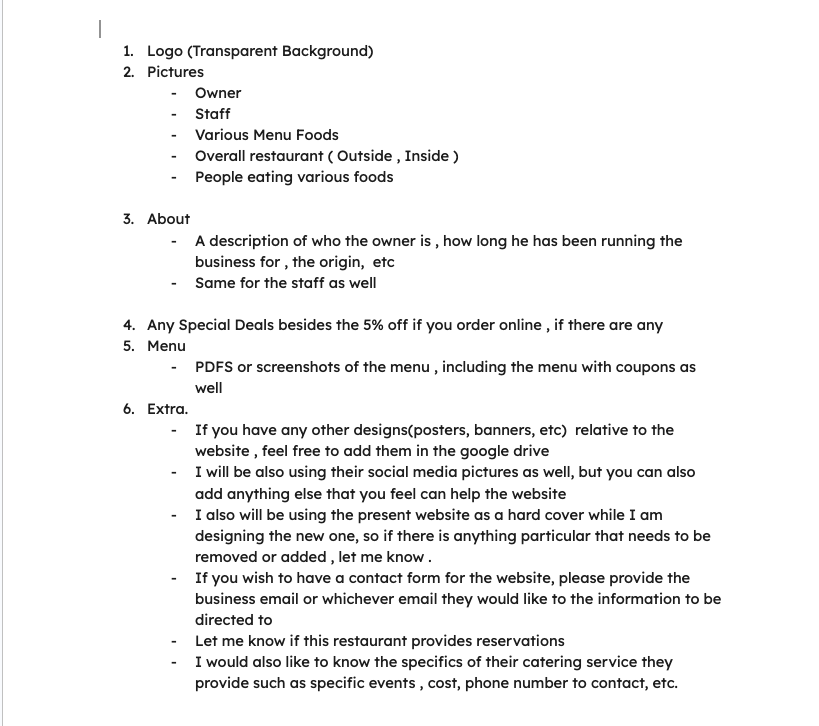
I met with my associate to discuss her boyfriend’s goals for the website. Their priorities included a responsive layout, a clear presentation of the business, an appealing UI, and a well-structured menu to showcase food options. We also explored ways to incorporate photos and videos that would capture the restaurant’s atmosphere and enhance visual appeal. In addition to their input, I contributed my own insights and design requirements—focusing on usability, layout clarity, and customer engagement strategies—to elevate the site’s effectiveness. These combined perspectives shaped the project direction and ensured the final design would attract customers while delivering a seamless user experience.
IDEATION & DESIGN PROCESS
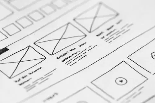
I began by creating the initial wireframes , outlining the header, body, and footer to establish the site’s structure. After reviewing these layouts with my associate, I refined the design direction and prepared the visual content, including food photography and environment‑focused video assets.
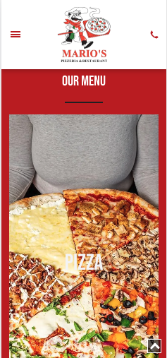
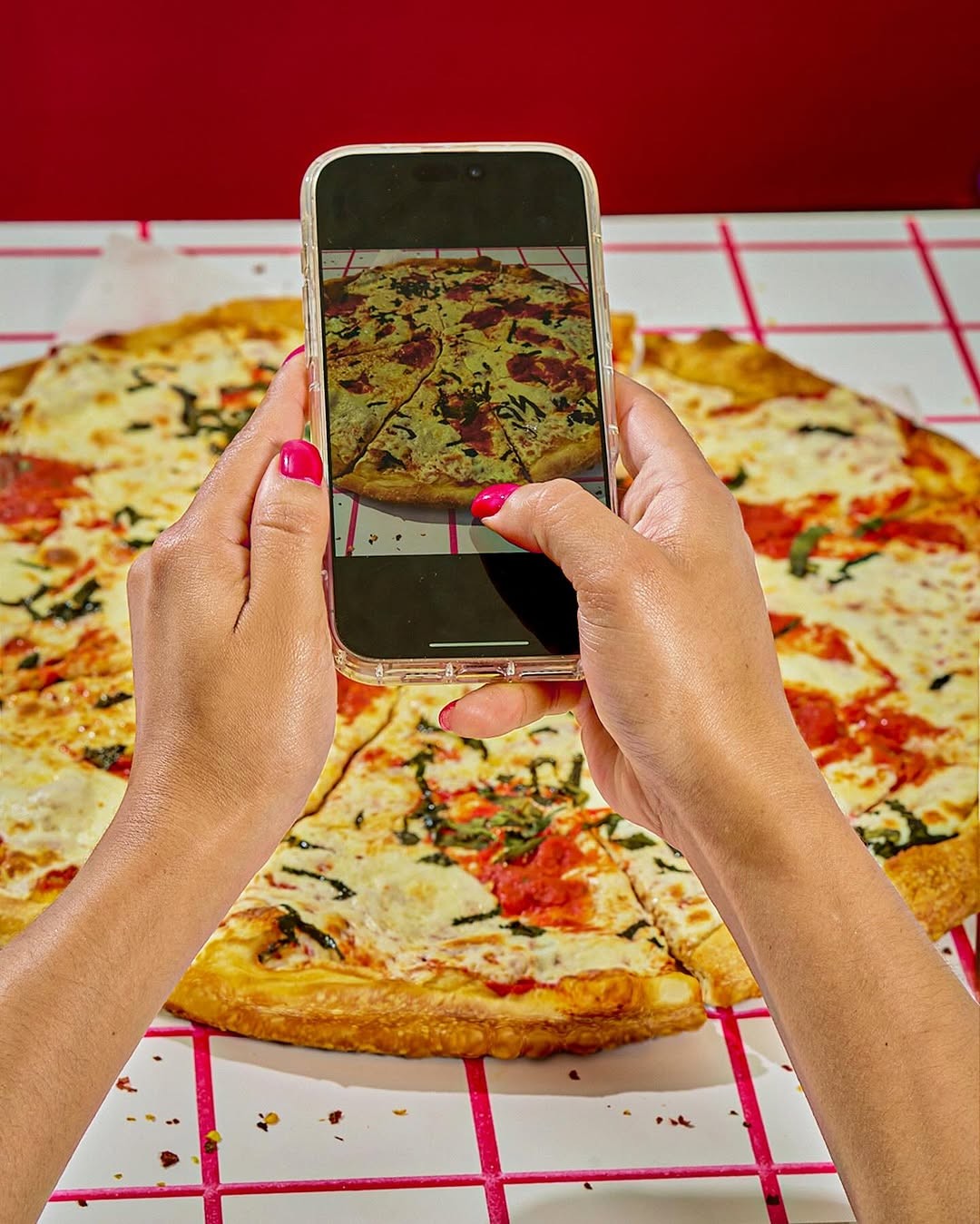
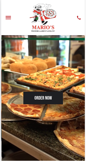
I translated the finalized wireframes into a full website build in Duda, designing the experience around how customers naturally explore a restaurant online. The homepage opened with a welcoming, inviting layout, featuring a clear, structured header incorporating business colors that immediately oriented users. Just below the header, I included carefully selected visuals—including high‑quality images of the food, interior, and overall atmosphere—to create an immersive first impression and help users quickly understand what the restaurant offers. Beneath these visuals,
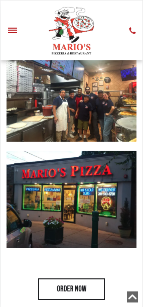
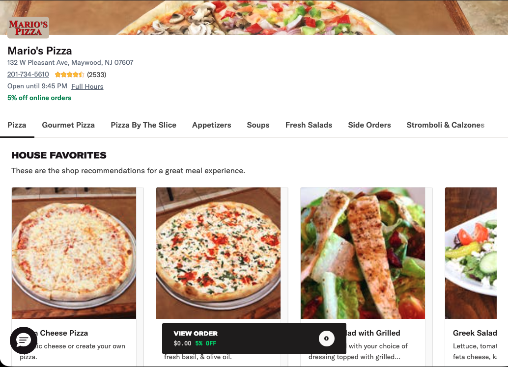
I highlighted the menu, services, and online‑ordering links in intuitive, easy‑to‑navigate placements that mirrored the flow of an in‑person dining experience. To support smooth user journeys, I implemented clear calls‑to‑action like “Order Now” and “View Menu,” ensuring customers could take action without friction. The final design delivered a streamlined, restaurant‑focused experience that made it effortless for users to explore the menu, understand the brand, and move confidently toward placing an order.
FINAL SOLUTION & REFLECTION
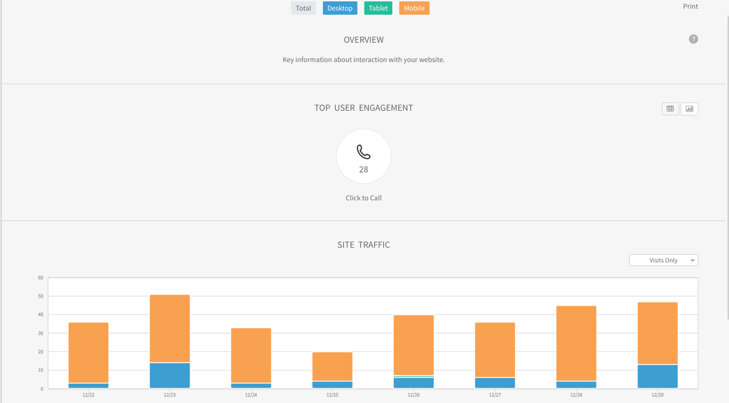
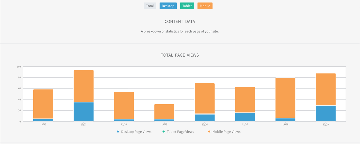
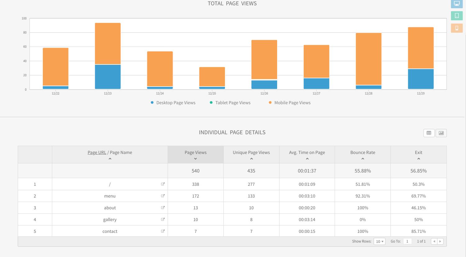
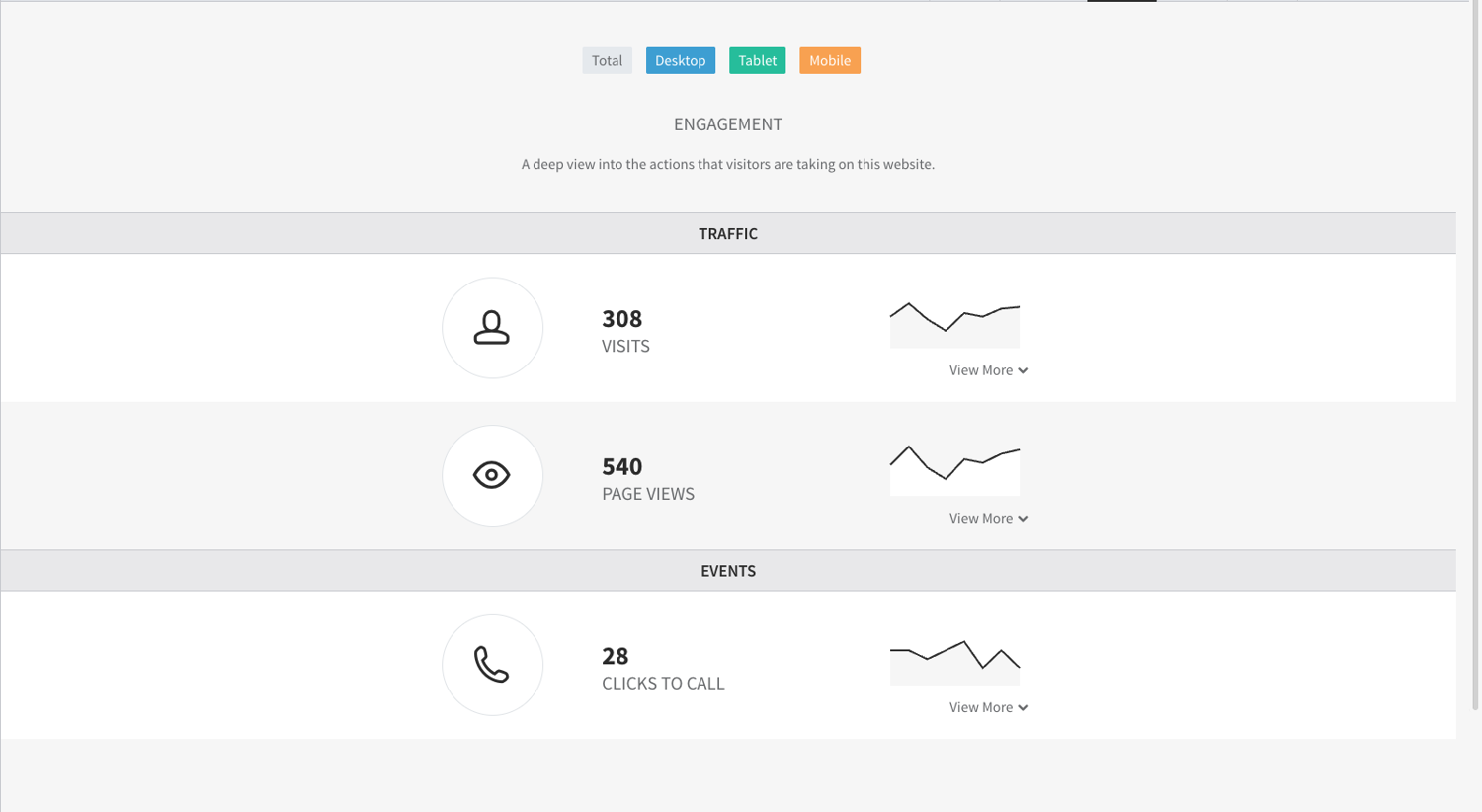
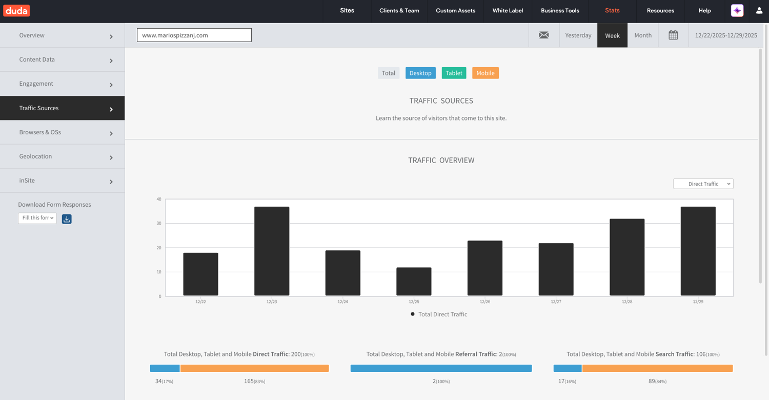
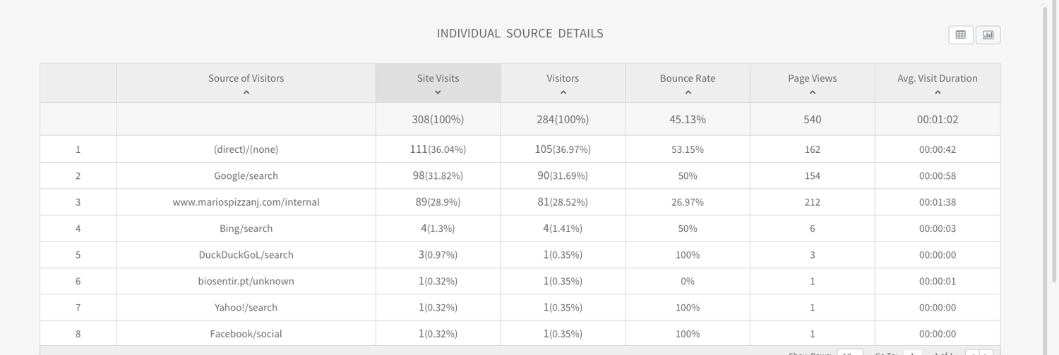
After several months of collaboration, we delivered a polished, user‑centered website for Mario’s Pizza that strengthened both customer experience and online visibility. I guided the client through each design decision, showing how choices around layout, hierarchy, responsiveness, and content structure supported clarity and usability. Because of these design choices, the site saw a significant rise in engagement: mobile traffic grew to 83% of total visits, the homepage reached 540 views with an average time on page of 1 minute and 37 seconds, and 28 direct “Click to Call” actions were recorded—clear signs of stronger customer interest and easier access to key actions. Search traffic also increased to 106 visits, reflecting improved SEO through cleaner structure, optimized metadata, and more accessible content. These results showed how intentional UX and SEO‑driven design can elevate a small business’s visibility, customer flow, and brand recognition. This project strengthened my ability to translate business goals into practical design decisions, communicate effectively with clients, and design for real customer journeys. It also reinforced core UX/UI skills—research, user empathy, visual hierarchy, responsive design, and iterative problem‑solving—demonstrating my readiness to add value in a professional environment through customer experience, client acquisition, and high‑quality digital products.
View Website
PROTOTYPE & TESTING
Once the prototypes were ready, I tested the site across multiple dimensions. I measured site speed and loading duration to ensure performance was smooth. Responsiveness was checked on desktop, tablet, and mobile devices to confirm that the header, body, and footer adapted seamlessly. I also observed friends navigating through the site, noting how they interacted with the header menu, scrolled through the body content, and used the footer links. Their feedback helped me refine animations, adjust spacing, and simplify navigation labels for clarity.


FINAL SOLUTION & REFLECTION
The redesigned JojiCaptures site strengthened its identity as a freelance creative brand by pairing clear navigation with a modern, responsive UI that highlights services and past work. A structured header, informative body sections, and an accessible footer helped users quickly understand offerings and reach out. Thoughtful typography and hierarchy guided attention to key content, while responsive layouts ensured a smooth experience across devices.
Throughout the project, I focused on user needs, balancing creativity with usability. Moving from sketches to prototypes and testing for clarity, speed, and responsiveness helped refine the final design. Early feedback showed meaningful improvements: clearer navigation, a more professional visual identity, and a noticeably more engaging browsing experience.
The redesign also created measurable value for the business. JojiCaptures saw increased recognition within local creative circles, more inquiries from potential clients, and stronger networking opportunities through shared work and referrals. These outcomes demonstrated how intentional design can elevate even a small freelance brand, helping it stand out and build trust.
This project strengthened essential UX/UI abilities—research, user empathy, visual hierarchy, responsive design, and iterative problem‑solving. These skills directly support the roles and internships I’m pursuing, demonstrating not only my ability to design thoughtful, user‑centered solutions but also my readiness to add value in a professional environment
View Website
FREELANCE & AGENCY PROJECTS
A curated collection of projects from my freelance brand JojiCaptures and my agency work with SKY Marketing LLC. Organized from recent to past, this section showcases work across different clients and industries, featuring skills in UX/UI design, web design, front‑end development, and brand‑focused digital experiences.


RESEARCH & DISCOVERY
I began by identifying what clients and recruiters value most in service ads: clarity, visual appeal, and immediate understanding of offerings. I studied successful freelance and agency ads across platforms, noting how they used layout, typography, and imagery to communicate value. I mapped out how each JojiCaptures service—logo design, banners, media production, and web design—could be represented through social-media-ready visuals.
PROJECT NAME
JojiCaptures Website
CONTENT
Website Redesign
YEAR
Sept 2025 - Nov 2025
INTRODUCTION
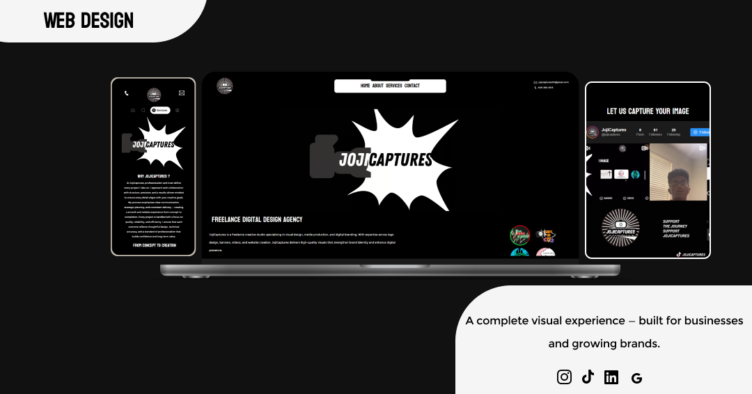
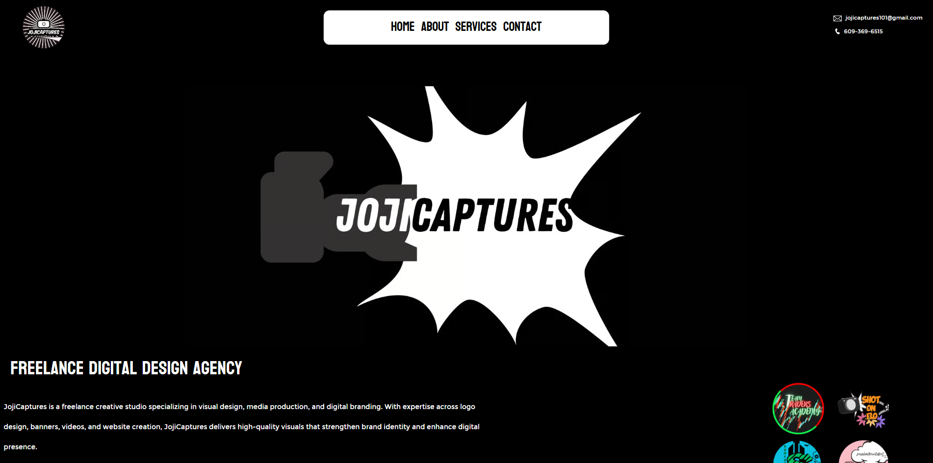
JojiCaptures is my freelance creative agency focused on designing logos, banners, videos, and websites for entrepreneurs and businesses. The original website was basic, unresponsive, and lacked an appealing user interface, which made it difficult to attract potential clients. My goal was to redesign the site so that it not only looked professional but also communicated the value of my services clearly and engaged users to start their projects
DEFINING THE PROBLEM
The old site lacked structure and failed to highlight JojiCaptures’ creative identity. Navigation was unclear, the UI was flat, and there were no engaging elements to keep users interested. The redesign aimed to solve these issues by creating a responsive layout with a strong header, informative body content, and a polished footer, all enhanced with animations to guide user attention.
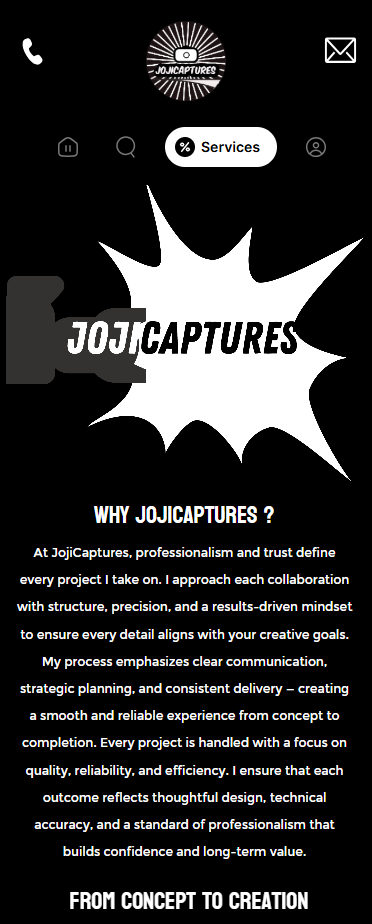
WHAT IS JOJICAPTURES?
SERVICES SPECIFIED
USER EXPECTATIONS
TARGET AUDIENCE?
RESEARCH & DISCOVERY
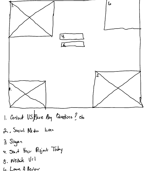
To understand what users wanted from the site, I began by researching competitor websites and analyzing how successful creative agencies presented themselves online. I also asked peers and past clients what they expected to see when visiting a creative portfolio site. Their feedback revealed that users wanted clarity about services offered, examples of past projects, and a simple way to get started on their own project. This research guided me to focus on user needs such as responsive design, strong visual hierarchy, and clear calls to action. By putting myself in the client’s shoes, I was able to identify the gaps in my original site and set a direction for the redesign.
IDEATION & DESIGN PROCESS
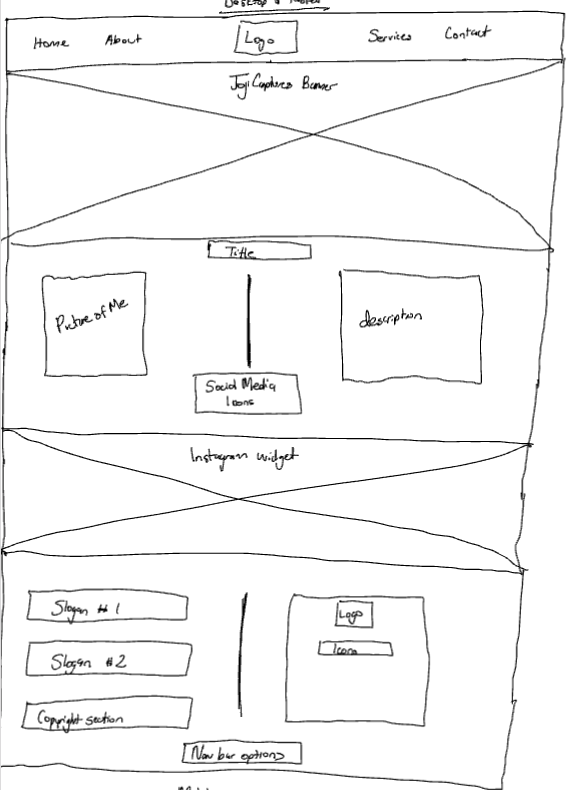
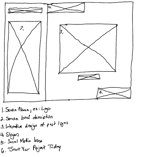
I began with hand‑drawn wireframes to outline the site’s structure. These sketches helped me plan how visitors would move through the header, body, and footer, ensuring a clear flow from navigation to business identity to services and to contact options.
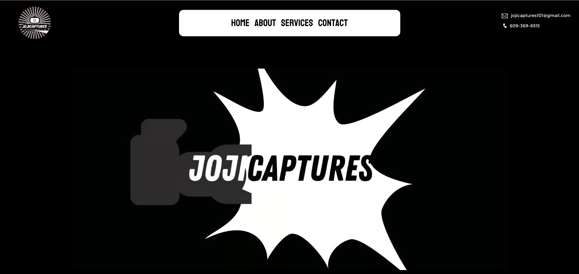
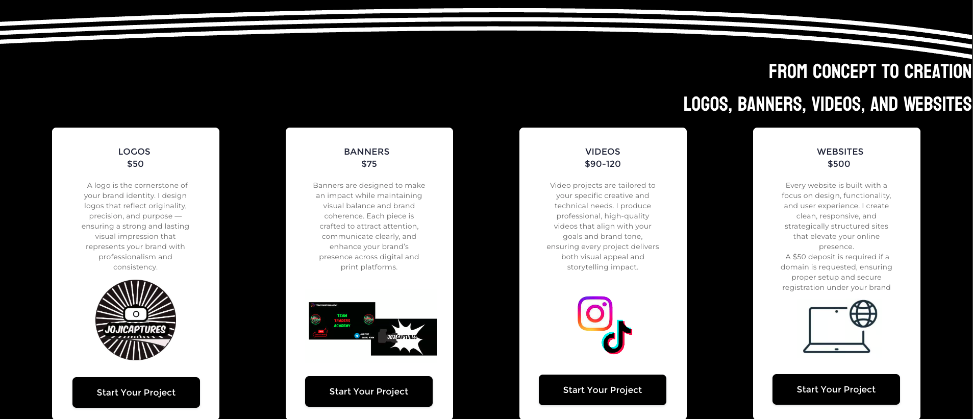
Once the structure was mapped, I created high‑fidelity prototypes in Figma. This stage allowed me to refine the layout and introduce interactive elements. Social media widgets were added to connect users directly to JojiCaptures, while contact details were placed in both the footer and a dedicated section. Calls‑to‑action such as “Start Your Project” and “View My Work” were positioned to encourage engagement.
The overall design emphasized clean typography and strong hierarchy. Headings highlighted key sections, body text remained simple and readable, and content blocks were arranged logically to showcase services and past projects. Subtle animations like hover effects, smooth scrolling, and transitions gave the site a polished, modern feel while keeping the experience approachable and user‑friendly.
PROTOTYPE & TESTING
Once the prototypes were ready, I tested the site across multiple dimensions. I measured site speed and loading duration to ensure performance was smooth. Responsiveness was checked on desktop, tablet, and mobile devices to confirm that the header, body, and footer adapted seamlessly. I also observed friends navigating through the site, noting how they interacted with the header menu, scrolled through the body content, and used the footer links. Their feedback helped me refine animations, adjust spacing, and simplify navigation labels for clarity.


PROTOTYPE & TESTING
High-fidelity prototypes were developed and tested across social media platforms to ensure responsiveness and readability. I refined layouts to ensure images and text flowed naturally, while calls-to-action remained prominent. Feedback confirmed that the banners were visually appealing, clearly communicated services, and aligned with JojiCaptures’ brand.
Marios Pizza Website
JojiCaptures Website
Noches To Go Website
JojiCaptures Service Ad
Lady Doctor MD
JojiCaptures Service Ad
Noches To Go Website
Marios Pizza Website
JojiCaptures Website
Lady Doctor MD
JojiCaptures Service Ad
Noches To Go Website
Marios Pizza Website
JojiCaptures Website
Lady Doctor MD
JojiCaptures Service Ad
Noches To Go Website
Marios Pizza Website
JojiCaptures Website
Lady Doctor MD
JojiCaptures Service Ad
Noches To Go Website
Marios Pizza Website
JojiCaptures Website
Lady Doctor MD
JojiCaptures Service Ad
Noches To Go Website
Marios Pizza Website
JojiCaptures Website
. Lady Doctor MD
FINAL SOLUTION & REFLECTION
The redesigned JojiCaptures site strengthened its identity as a freelance creative brand by pairing clear navigation with a modern, responsive UI that highlights services and past work. A structured header, informative body sections, and an accessible footer helped users quickly understand offerings and reach out. Thoughtful typography and hierarchy guided attention to key content, while responsive layouts ensured a smooth experience across devices.
Throughout the project, I focused on user needs, balancing creativity with usability. Moving from sketches to prototypes and testing for clarity, speed, and responsiveness helped refine the final design. Early feedback showed meaningful improvements: clearer navigation, a more professional visual identity, and a noticeably more engaging browsing experience.
The redesign also created measurable value for the business. JojiCaptures saw increased recognition within local creative circles, more inquiries from potential clients, and stronger networking opportunities through shared work and referrals. These outcomes demonstrated how intentional design can elevate even a small freelance brand, helping it stand out and build trust.
This project strengthened essential UX/UI abilities—research, user empathy, visual hierarchy, responsive design, and iterative problem‑solving. These skills directly support the roles and internships I’m pursuing, demonstrating not only my ability to design thoughtful, user‑centered solutions but also my readiness to add value in a professional environment
View Website


PROTOTYPE & TESTING
Once prototypes were ready, I tested responsiveness across desktop, tablet, and mobile. Site optimization was performed to improve speed and performance. I ensured links to the online ordering platform worked correctly and refined the UI design to highlight the restaurant’s theme. Feedback confirmed that the visuals and layout made the site more appealing, helping attract customers and improve engagement.
INTRODUCTION
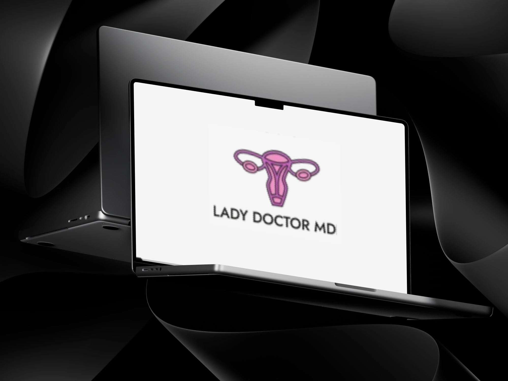
Lady Doctor MD is a medical practice dedicated to providing personalized, high-quality gynecological care. The objective was to create a visual identity that feels both authoritative and accessible, moving away from the sterile, cold aesthetic often associated with traditional clinical branding.
I moved into high‑fidelity prototyping through Duda and incorporated brand colors, food photography, videography, and interactive buttons linking to SKY Ordering. I applied HCI principles ( Human Computer Interaction)—especially emotional design—by including photos of real customers dining, being served, and enjoying meals at various locations to build trust and authenticity. The design emphasized clarity, responsiveness, human emotion, and visual hierarchy to guide users through the site in a natural, intuitive way.
DEFINING THE PROBLEM
The client required a modern digital identity specifically designed to target and resonate with a female audience while moving away from sterile medical clichés. She wanted a brand that felt unapologetically feminine and professional, serving as a visual "safe space" that signaled comfort and inclusivity to all her clients. The goal was to create a visual identity that immediately communicated her specialty to a digital-first demographic, balancing a welcoming, supportive aesthetic with the authority of a board-certified physician.
RESEARCH & DISCOVERY
To understand the current landscape of medical branding, I conducted extensive research using platforms like Pinterest to analyze how modern healthcare logos present themselves. My research revealed a shift toward lifestyle-oriented designs that prioritize patient comfort. A key discovery during this phase was the client’s specific desire to include a stylized uterus symbol; she viewed this anatomical clarity as a way to symbolize transparency, deep specialization, and the professional trust she builds with her patients.


IDEATION & DESIGN PROCESS
The design process focused on transforming the uterus into a clean, iconic emblem that felt modern rather than clinical. To align with the client’s vision, I incorporated her business colors of pink and purple into the icon, creating a custom gradient to blend them seamlessly. I also explored and tested various typography styles, focusing on clean, professional fonts that clearly displayed the brand name while maintaining a high-end feel. The goal was to find a typeface that felt modern and legible, ensuring the "MD" suffix carried the necessary weight of her medical credentials.

LADY DOCTOR MD
LADY DOCTOR MD
LADY DOCTOR MD
LADY DOCTOR MD
PROTOTYPING & TESTING
During the testing phase, I applied the logo to various digital and physical mockups to ensure versatility. A primary focus was testing the logo on research paper and medical document mockups, as the client documents and shares research findings with her patients. It was vital that the gradient and fine lines remained crisp and legible on white paper, maintaining a high-end, academic feel for her professional documentation and educational resources.
FINAL SOLUTION & REFELECTION
I presented the final design to the client by explaining the strategic thought process behind the anatomical symbolism and typographic hierarchy. With the client feedback, we were able to deliver a cohesive identity that spans all her professional materials, securing her enthusiastic approval. This project taught me to take initiative and act as a proactive problem solver by translating direct client feedback into high-value visual solutions. This ability to combine research-backed strategy with creative execution is a significant asset to any branding team, as it helps businesses differentiate themselves in a crowded market, establish immediate credibility, and foster the long-term recognition necessary to drive client loyalty and growth.


PROJECT NAME
JojiCaptures Website
CONTENT
Website Redesign
YEAR
Sept 2025 - Nov 2025
PROJECT NAME
Mario Pizza Website
CONTENT
Website Redesign
YEAR
Sept 2025 - Dec 2025
PROJECT NAME
Noches Tio Go Website
CONTENT
Website Redesign
YEAR
Sept 2025 - Dec 2025
PROJECT NAME
JojiCaptures Service Ad
CONTENT
Digital Services Advertisement
YEAR
Dec 2025
PROJECT NAME
Lady Doctor MD Logo
CONTENT
Logo Creation
YEAR
Jan 2026
Marios Pizza Website
JojiCaptures Website
Noches To Go Website
JojiCaptures Service Ad
Lady Doctor MD
Marios Pizza Website
JojiCaptures Website
Noches To Go Website
JojiCaptures Service Ad
Lady Doctor MD
Marios Pizza Website
JojiCaptures Website
Noches To Go Website
JojiCaptures Service Ad
Lady Doctor MD
Marios Pizza Website
JojiCaptures Website
Noches To Go Website
JojiCaptures Service Ad
Lady Doctor MD
Marios Pizza Website
JojiCaptures Website
Noches To Go Website
JojiCaptures Service Ad
Lady Doctor MD
FREELANCE & AGENCY PROJECTS
A curated collection of projects from my freelance brand JojiCaptures and my agency work with SKY Marketing LLC. Organized from recent to past, this section showcases work across different clients and industries, featuring skills in UX/UI design, web design, front‑end development, and brand‑focused digital experiences.
INTRODUCTION
To strengthen JojiCaptures’ freelance identity and attract new collaborations, I designed a service ad banner campaign that visually communicates the creative services offered. The goal was to use clean, engaging visuals—featuring real project work—to build trust, clarify offerings, and increase visibility across digital platforms.
RESEARCH & DISCOVERY
I began by identifying what clients and recruiters value most in service ads: clarity, visual appeal, and immediate understanding of offerings. I studied successful freelance and agency ads across platforms, noting how they used layout, typography, and imagery to communicate value. I mapped out how each JojiCaptures service—logo design, banners, media production, and web design—could be represented through social-media-ready visuals.
DEFINING THE PROBLEM
JojiCaptures lacked a strong visual presence and clear messaging around its services. Potential clients struggled to understand what was offered, and the brand wasn’t gaining traction online. Without a compelling way to showcase capabilities, outreach and engagement remained limited.
1. ClIENT ATTRACTION
2.VISUAL MEANING
4. ONLINE PRESENCE
3. CORE COMPETENCY
IDEATION & DESIGN PROCESS
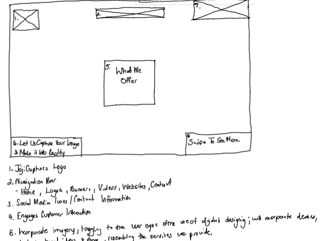
I began the design process by creating hand-drawn wireframes to explore layout, hierarchy, and visual balance. These sketches allowed me to quickly iterate and refine ideas on paper, focusing on clarity and user engagement.
Once the concepts were solidified, I translated the wireframes into high-fidelity digital designs using Figma. This transition enabled precise control over spacing, color, typography, and branding elements, ensuring consistency across all ads. By treating each banner like a social media post, I combined compelling visuals with concise, impactful text to create engaging, easy-to-understand assets optimized for digital platforms.
PROTOTYPE & TESTING
High-fidelity prototypes were developed and tested across social media platforms to ensure responsiveness and readability. I refined layouts to ensure images and text flowed naturally, while calls-to-action remained prominent. Feedback confirmed that the banners were visually appealing, clearly communicated services, and aligned with JojiCaptures’ brand.


FINAL SOLUTION & REFLECTION
The final solution now speaks directly to recruiters by clearly presenting the clean, visually engaging ad banners that effectively communicated JojiCaptures’ services through real project imagery and consistent branding. This design significantly boosted client attraction and collaboration opportunities, enhancing JojiCaptures’ visibility and credibility in a competitive market. The project demonstrated how strategic design directly drives business growth by improving brand clarity and engagement.
I learned that my skills in user-centered design, visual hierarchy, and digital marketing enable me to craft compelling communication that effectively attracts and retains clients, making me a valuable asset in helping businesses succeed in today’s competitive economy. This case study highlights my ability to combine empathy, design strategy, and platform awareness to create impactful solutions that advance both the business and its clients.
TikTok
INTRODUCTION
During my internship as a Web Designer at SKY Marketing LLC, I was tasked to redesign Noches To Go, a centralized online ordering platform for multiple Noches de Colombia locations across New Jersey. The goal was to create a responsive, modern website that allowed users to browse menus, select their preferred location, and place orders seamlessly through our ordering platform, SKY Digital Ordering. The redesign needed to elevate the brand’s digital presence, reflect its cultural identity, and deliver an app‑like experience that felt intuitive, fast, and visually engaging.
DEFINING THE PROBLEM
The original Noches To Go website lacked structure, clarity, and essential information, resulting in a weak user experience. It had a bland visual layout, minimal brand identity, and missing details about restaurant locations, services, and partner restaurants. The site also lacked emotional appeal due to limited photography and had poor visual hierarchy, making navigation unclear. The redesign needed to transform the platform into a structured, informative, and visually compelling experience for customers
IDEATION & DESIGN PROCESS
I began by creating wireframes for each page, mapping out the header, footer, image placement, typography hierarchy, button layout, and location sections.
I moved into high‑fidelity prototyping through Duda and incorporated brand colors, food photography, videography, and interactive buttons linking to SKY Ordering. I applied HCI principles ( Human Computer Interaction)—especially emotional design—by including photos of real customers dining, being served, and enjoying meals at various locations to build trust and authenticity. The design emphasized clarity, responsiveness, human emotion, and visual hierarchy to guide users through the site in a natural, intuitive way.
PROTOTYPE & TESTING
Once the prototype was complete, I conducted extensive testing across desktop, tablet, and mobile devices to ensure a smooth, app‑like experience. I evaluated navigation flow, button visibility, page load speed, ordering link functionality, and readability without disrupting the user journey.
FINAL SOLUTION & REFLECTION
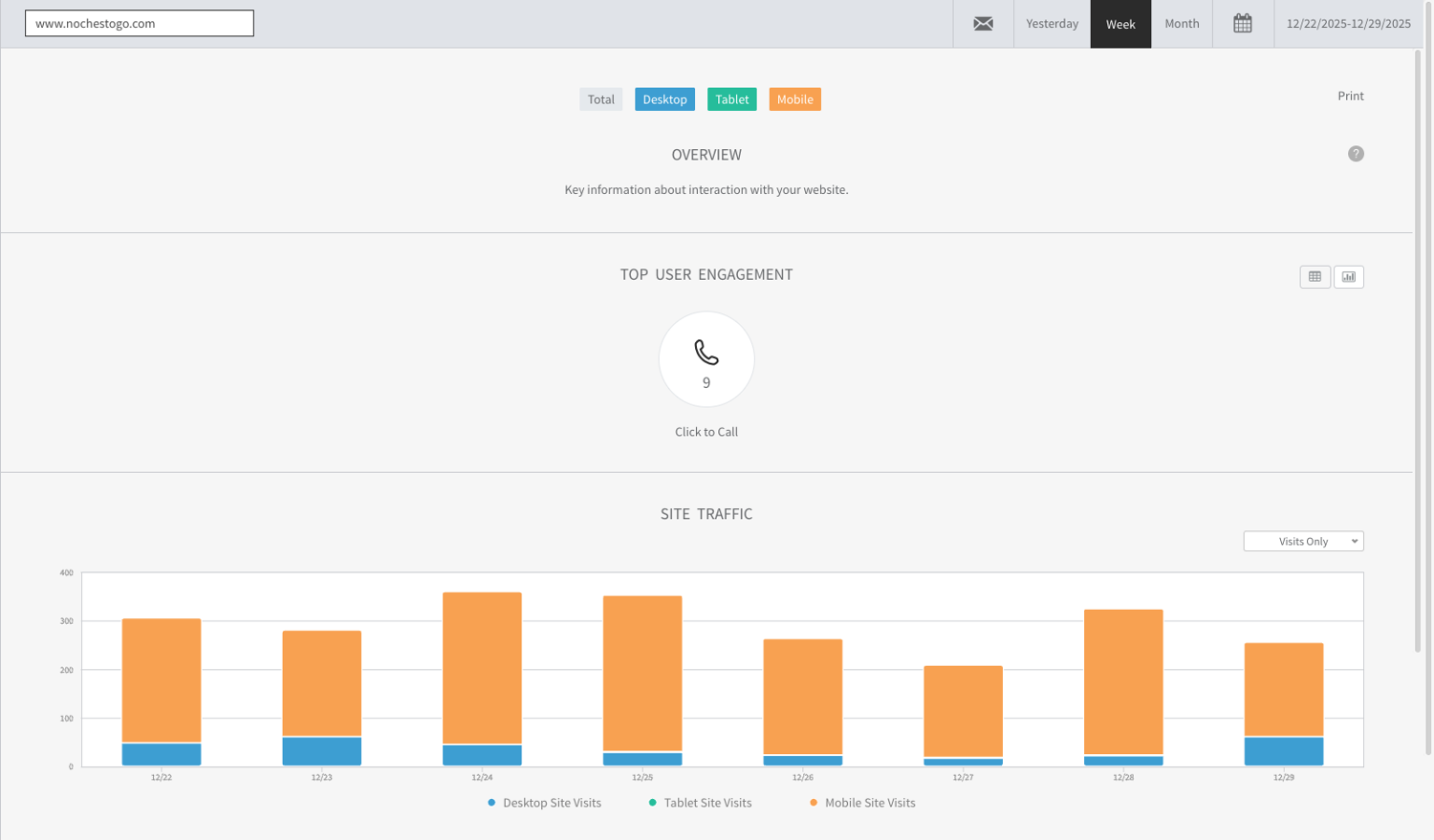
The final Noches To Go website brought together a clean, modern, and cohesive digital presence that made ordering simple across multiple restaurant locations. I focused on intuitive navigation, strong visual hierarchy, and clear “Order Now” pathways, supported by a fully responsive layout that aligned with real user behavior—mobile users accounted for 87% of all visits and 86% of page views, making mobile‑first design essential to the platform’s success.
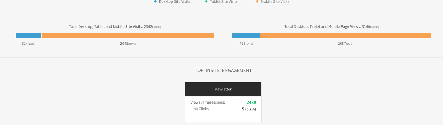
As you review this case study, you’ll see how the redesign translated directly into stronger engagement. The homepage reached 3160 views with an average time on page of 2 minutes and 40 seconds, while the “Our Locations” page saw 2845 views with similarly strong engagement. Internal navigation performed especially well, generating 415 page views with a bounce rate of just 20.22%, compared to over 55% on search traffic and 61% on direct traffic. Across the week, users generated 2362 total visits, 3160 page views, 9 click‑to‑call interactions, and more than 2400 newsletter impressions—clear signs that the refined layout and interaction patterns encouraged deeper exploration and more meaningful actions.
This project strengthened my ability to design scalable, multi‑location systems and translate business goals into user‑centered digital experiences. And this is exactly where I can support you: by simplifying complex flows, improving conversion through thoughtful UX, and building digital platforms that help your business grow. Whether you’re expanding an ordering system, improving customer engagement, or elevating a brand’s online presence, I bring a design approach that creates experiences users love—and delivers measurable results that move your business forward.
View Website
INTRODUCTION
During my internship as a Web Designer at SKY Marketing LLC, I was asked to redesign the website for Marios Pizza, a restaurant owned by my associate’s boyfriend. The old site was outdated, lacked a header, footer, and menu, and did not clearly represent the business. My goal was to create a responsive, modern website that reflected the restaurant’s identity, showcased its food and services, and attracted customers with a clear, engaging experience.
DEFINING THE PROBLEM
The old site failed to represent Marios Pizza as a professional business. It lacked structure, clarity, and visual appeal. The redesign needed to solve these issues by creating a clean layout, adding navigation elements, incorporating visual content , and presenting information in a way that was easy for customers to understand and engaging enough to draw them in.
IDEATION & DESIGN PROCESS
I began by creating the initial wireframes , outlining the header, body, and footer to establish the site’s structure. After reviewing these layouts with my associate, I refined the design direction and prepared the visual content, including food photography and environment‑focused video assets.
I translated the finalized wireframes into a full website build in Duda, designing the experience around how customers naturally explore a restaurant online. The homepage opened with a welcoming, inviting layout, featuring a clear, structured header incorporating business colors that immediately oriented users. Just below the header, I included carefully selected visuals—including high‑quality images of the food and overall atmosphere—to create an immersive first impression and help users quickly understand what the restaurant offers. Beneath these visuals,
I highlighted the menu, services, and online‑ordering links in intuitive, easy‑to‑navigate placements that mirrored the flow of an in‑person dining experience. To support smooth user journeys, I implemented clear calls‑to‑action like “Order Now” and “View Menu,” ensuring customers could take action without friction. The final design delivered a streamlined, restaurant‑focused experience that made it effortless for users to explore the menu, understand the brand, and move confidently toward placing an order.
PROTOTYPE & TESTING
Once prototypes were ready, I tested responsiveness across desktop, tablet, and mobile. Site optimization was performed to improve speed and performance. I ensured links to the online ordering platform worked correctly and refined the UI design to highlight the restaurant’s theme. Feedback confirmed that the visuals and layout made the site more appealing, helping attract customers and improve engagement.
FINAL SOLUTION & REFLECTION
After several months of collaboration, we delivered a polished, user‑centered website for Mario’s Pizza that strengthened both customer experience and online visibility. I guided the client through each design decision, showing how choices around layout, hierarchy, responsiveness, and content structure supported clarity and usability. Because of these design choices, the site saw a significant rise in engagement: mobile traffic grew to 83% of total visits, the homepage reached 540 views with an average time on page of 1 minute and 37 seconds, and 28 direct “Click to Call” actions were recorded—clear signs of stronger customer interest and easier access to key actions. Search traffic also increased to 106 visits, reflecting improved SEO through cleaner structure, optimized metadata, and more accessible content. These results showed how intentional UX and SEO‑driven design can elevate a small business’s visibility, customer flow, and brand recognition. This project strengthened my ability to translate business goals into practical design decisions, communicate effectively with clients, and design for real customer journeys. It also reinforced core UX/UI skills—research, user empathy, visual hierarchy, responsive design, and iterative problem‑solving—demonstrating my readiness to add value in a professional environment through customer experience, client acquisition, and high‑quality digital products.
View Website
INTRODUCTION
JojiCaptures is my freelance creative agency focused on designing logos, banners, videos, and websites for entrepreneurs and businesses. The original website was basic, unresponsive, and lacked an appealing user interface, which made it difficult to attract potential clients. My goal was to redesign the site so that it not only looked professional but also communicated the value of my services clearly and engaged users to start their projects
RESEARCH & DISCOVERY
To understand what users wanted from the site, I began by researching competitor websites and analyzing how successful creative agencies presented themselves online. I also asked peers and past clients what they expected to see when visiting a creative portfolio site. Their feedback revealed that users wanted clarity about services offered, examples of past projects, and a simple way to get started on their own project. This research guided me to focus on user needs such as responsive design, strong visual hierarchy, and clear calls to action. By putting myself in the client’s shoes, I was able to identify the gaps in my original site and set a direction for the redesign.
WHAT IS JOJICAPTURES?
SERVICES SPECIFIED
USER EXPECTATIONS
TARGET AUDIENCE?
DEFINING THE PROBLEM
The old site lacked structure and failed to highlight JojiCaptures’ creative identity. Navigation was unclear, the UI was flat, and there were no engaging elements to keep users interested. The redesign aimed to solve these issues by creating a responsive layout with a strong header, informative body content, and a polished footer, all enhanced with animations to guide user attention.
IDEATION & DESIGN PROCESS
I began with hand‑drawn wireframes to outline the site’s structure. These sketches helped me plan how visitors would move through the header, body, and footer, ensuring a clear flow from navigation to business identity to services and to contact options.
Once the structure was mapped, I created high‑fidelity prototypes in Figma. This stage allowed me to refine the layout and introduce interactive elements. Social media widgets were added to connect users directly to JojiCaptures, while contact details were placed in both the footer and a dedicated section. Calls‑to‑action such as “Start Your Project” and “View My Work” were positioned to encourage engagement.
The overall design emphasized clean typography and strong hierarchy. Headings highlighted key sections, body text remained simple and readable, and content blocks were arranged logically to showcase services and past projects. Subtle animations like hover effects, smooth scrolling, and transitions gave the site a polished, modern feel while keeping the experience approachable and user‑friendly.
PROTOTYPE & TESTING
Once the prototypes were ready, I tested the site across multiple dimensions. I measured site speed and loading duration to ensure performance was smooth. Responsiveness was checked on desktop, tablet, and mobile devices to confirm that the header, body, and footer adapted seamlessly. I also observed friends navigating through the site, noting how they interacted with the header menu, scrolled through the body content, and used the footer links. Their feedback helped me refine animations, adjust spacing, and simplify navigation labels for clarity.
FINAL SOLUTION & REFLECTION
The redesigned JojiCaptures site strengthened its identity as a freelance creative brand by pairing clear navigation with a modern, responsive UI that highlights services and past work. A structured header, informative body sections, and an accessible footer helped users quickly understand offerings and reach out. Thoughtful typography and hierarchy guided attention to key content, while responsive layouts ensured a smooth experience across devices.
Throughout the project, I focused on user needs, balancing creativity with usability. Moving from sketches to prototypes and testing for clarity, speed, and responsiveness helped refine the final design. Early feedback showed meaningful improvements: clearer navigation, a more professional visual identity, and a noticeably more engaging browsing experience.
The redesign also created measurable value for the business. JojiCaptures saw increased recognition within local creative circles, more inquiries from potential clients, and stronger networking opportunities through shared work and referrals. These outcomes demonstrated how intentional design can elevate even a small freelance brand, helping it stand out and build trust.
This project strengthened essential UX/UI abilities—research, user empathy, visual hierarchy, responsive design, and iterative problem‑solving. These skills directly support the roles and internships I’m pursuing, demonstrating not only my ability to design thoughtful, user‑centered solutions but also my readiness to add value in a professional environment
View Website
Task Flows and Task Analysis
To solve the design challenge, you compiled a set of design needs. The solution needs to meet the needs of users such as flexibility, easier search,...
Wireframe - Prototype - Mockup
In this part, developed to find any screen components that are missing. Before going on to the high resolution mockups, the screens were built digitally and prototyped to conduct cognitive walkthrough testing and to restate the design.
Learning - Reflection - Next Step
In this section you should mention:
- What did you and your team learn from the problem solving process ?
- What you have learned ?
- Summarise the challenges you overcame, the company and the product
- What you plan to do in the future and what you have to improve during the last project ?
Usability Tests
In the user test insight section, you should pay attention to sections such as:
- Do users find it difficult to use the product or service ?
- Problems occurring during testing
- Why do these problems happen ?
- ...
Based on feedback and insight to create edits that match the wishes and desires of users
Summary of the solution after the second re-design:
- How to fix the problem in the second time ?
- What is the effect of second solution redesign ?
- Are the results consistent with the set goals ?
- ...
PROTOTYPE & TESTING
Once the prototypes were ready, I tested the site across multiple dimensions. I measured site speed and loading duration to ensure performance was smooth. Responsiveness was checked on desktop, tablet, and mobile devices to confirm that the header, body, and footer adapted seamlessly. I also observed friends navigating through the site, noting how they interacted with the header menu, scrolled through the body content, and used the footer links. Their feedback helped me refine animations, adjust spacing, and simplify navigation labels for clarity.
FINAL SOLUTION & REFLECTION
The redesigned JojiCaptures site strengthened its identity as a freelance creative brand by pairing clear navigation with a modern, responsive UI that highlights services and past work. A structured header, informative body sections, and an accessible footer helped users quickly understand offerings and reach out. Thoughtful typography and hierarchy guided attention to key content, while responsive layouts ensured a smooth experience across devices.
Throughout the project, I focused on user needs, balancing creativity with usability. Moving from sketches to prototypes and testing for clarity, speed, and responsiveness helped refine the final design. Early feedback showed meaningful improvements: clearer navigation, a more professional visual identity, and a noticeably more engaging browsing experience.
The redesign also created measurable value for the business. JojiCaptures saw increased recognition within local creative circles, more inquiries from potential clients, and stronger networking opportunities through shared work and referrals. These outcomes demonstrated how intentional design can elevate even a small freelance brand, helping it stand out and build trust.
This project strengthened essential UX/UI abilities—research, user empathy, visual hierarchy, responsive design, and iterative problem‑solving. These skills directly support the roles and internships I’m pursuing, demonstrating not only my ability to design thoughtful, user‑centered solutions but also my readiness to add value in a professional environment
View Website
RESEARCH & DISCOVERY
To begin the project, I met with my boss, Jason, to identify the improvements needed, with the main priority being to enhance the user experience and make the site feel more like a dedicated ordering app. I conducted competitive research by studying well‑known restaurant websites and analyzing how they used typography, visual hierarchy, photography, videography, and layout to guide user behavior. This research helped me understand how successful platforms structure content to improve user flow, reduce friction, and encourage ordering, ultimately shaping the design direction for Noches To Go.
RESEARCH & DISCOVERY
I met with my associate to discuss her boyfriend’s goals for the website. Their priorities included a responsive layout, a clear presentation of the business, an appealing UI, and a well-structured menu to showcase food options. We also explored ways to incorporate photos and videos that would capture the restaurant’s atmosphere and enhance visual appeal. In addition to their input, I contributed my own insights and design requirements—focusing on usability, layout clarity, and customer engagement strategies—to elevate the site’s effectiveness. These combined perspectives shaped the project direction and ensured the final design would attract customers while delivering a seamless user experience.
INTRODUCTION
Lady Doctor MD is a medical practice dedicated to providing personalized, high-quality gynecological care. The objective was to create a visual identity that feels both authoritative and accessible, moving away from the sterile, cold aesthetic often associated with traditional clinical branding.
DEFINING THE PROBLEM
The client required a modern digital identity specifically designed to target and resonate with a female audience while moving away from sterile medical clichés. She wanted a brand that felt unapologetically feminine and professional, serving as a visual "safe space" that signaled comfort and inclusivity to all her clients. The goal was to create a visual identity that immediately communicated her specialty to a digital-first demographic, balancing a welcoming, supportive aesthetic with the authority of a board-certified physician.
RESEARCH & DISCOVERY
To understand the current landscape of medical branding, I conducted extensive research using platforms like Pinterest to analyze how modern healthcare logos present themselves. My research revealed a shift toward lifestyle-oriented designs that prioritize patient comfort. A key discovery during this phase was the client’s specific desire to include a stylized uterus symbol; she viewed this anatomical clarity as a way to symbolize transparency, deep specialization, and the professional trust she builds with her patients.


IDEATION & DESIGN PROCESS
The design process focused on transforming the uterus into a clean, iconic emblem that felt modern rather than clinical. To align with the client’s vision, I incorporated her business colors of pink and purple into the icon, creating a custom gradient to blend them seamlessly. I also explored and tested various typography styles, focusing on clean, professional fonts that clearly displayed the brand name while maintaining a high-end feel. The goal was to find a typeface that felt modern and legible, ensuring the "MD" suffix carried the necessary weight of her medical credentials.
LADY DOCTOR MD
LADY DOCTOR MD
LADY DOCTOR MD
LADY DOCTOR MD

PROTOTYPING & TESTING
During the testing phase, I applied the logo to various digital and physical mockups to ensure versatility. A primary focus was testing the logo on research paper and medical document mockups, as the client documents and shares research findings with her patients. It was vital that the gradient and fine lines remained crisp and legible on white paper, maintaining a high-end, academic feel for her professional documentation and educational resources.
FINAL SOLUTION & REFELECTION
I presented the final design to the client by explaining the strategic thought process behind the anatomical symbolism and typographic hierarchy. With the client feedback, we were able to deliver a cohesive identity that spans all her professional materials, securing her enthusiastic approval. This project taught me to take initiative and act as a proactive problem solver by translating direct client feedback into high-value visual solutions. This ability to combine research-backed strategy with creative execution is a significant asset to any branding team, as it helps businesses differentiate themselves in a crowded market, establish immediate credibility, and foster the long-term recognition necessary to drive client loyalty and growth.
HOME
PROJECTS
CONTACT


+1 609-369-6515
My Resume


PROJECT NAME
JojiCaptures Service Ad
CONTENT
Digital Services Advertisement
YEAR
Dec 2025
Marios Pizza Website
JojiCaptures Website
Noches To Go Website
JojiCaptures Service Ad
Marios Pizza Website
JojiCaptures Website
Noches To Go Website
JojiCaptures Service Ad
PROJECT NAME
Noches To Go- Website
CONTENT
Website Redesign
YEAR
Sept 2025 - Dec 2025
Marios Pizza Website
JojiCaptures Website
JojiCaptures Website
Noches To Go Website
JojiCaptures Service Ad
FREELANCE & AGENCY PROJECTS
A curated collection of projects from my freelance brand JojiCaptures and my agency work with SKY Marketing LLC. Organized from recent to past, this section showcases work across different clients and industries, featuring skills in UX/UI design, web design, front‑end development, and brand‑focused digital experiences.
INTRODUCTION
To strengthen JojiCaptures’ freelance identity and attract new collaborations, I designed a service ad banner campaign that visually communicates the creative services offered. The goal was to use clean, engaging visuals—featuring real project work—to build trust, clarify offerings, and increase visibility across digital platforms.
RESEARCH & DISCOVERY
I began by identifying what clients and recruiters value most in service ads: clarity, visual appeal, and immediate understanding of offerings. I studied successful freelance and agency ads across platforms, noting how they used layout, typography, and imagery to communicate value. I mapped out how each JojiCaptures service—logo design, banners, media production, and web design—could be represented through social-media-ready visuals.
DEFINING THE PROBLEM
JojiCaptures lacked a strong visual presence and clear messaging around its services. Potential clients struggled to understand what was offered, and the brand wasn’t gaining traction online. Without a compelling way to showcase capabilities, outreach and engagement remained limited.
1. ClIENT ATTRACTION
2.VISUAL MEANING
4. ONLINE PRESENCE
3. CORE COMPETENCY
IDEATION & DESIGN PROCESS
I began the design process by creating hand-drawn wireframes to explore layout, hierarchy, and visual balance. These sketches allowed me to quickly iterate and refine ideas on paper, focusing on clarity and user engagement.
PROTOTYPE & TESTING
High-fidelity prototypes were developed and tested across social media platforms to ensure responsiveness and readability. I refined layouts to ensure images and text flowed naturally, while calls-to-action remained prominent. Feedback confirmed that the banners were visually appealing, clearly communicated services, and aligned with JojiCaptures’ brand.

FINAL SOLUTION & REFLECTION
The final solution now speaks directly to recruiters by clearly presenting the clean, visually engaging ad banners that effectively communicated JojiCaptures’ services through real project imagery and consistent branding. This design significantly boosted client attraction and collaboration opportunities, enhancing JojiCaptures’ visibility and credibility in a competitive market. The project demonstrated how strategic design directly drives business growth by improving brand clarity and engagement.
I learned that my skills in user-centered design, visual hierarchy, and digital marketing enable me to craft compelling communication that effectively attracts and retains clients, making me a valuable asset in helping businesses succeed in today’s competitive economy. This case study highlights my ability to combine empathy, design strategy, and platform awareness to create impactful solutions that advance both the business and its clients.
TikTok
Once the concepts were solidified, I translated the wireframes into high-fidelity digital designs using Figma. This transition enabled precise control over spacing, color, typography, and branding elements, ensuring consistency across all ads. By treating each banner like a social media post, I combined compelling visuals with concise, impactful text to create engaging, easy-to-understand assets optimized for digital platforms.
IDEATION & DESIGN PROCESS CONT.
INTRODUCTION
During my internship as a Web Designer at SKY Marketing LLC, I was asked to redesign the website for Marios Pizza, a restaurant owned by my associate’s boyfriend. The old site was outdated, lacked a header, footer, and menu, and did not clearly represent the business. My goal was to create a responsive, modern website that reflected the restaurant’s identity, showcased its food and services, and attracted customers with a clear, engaging experience.
IDEATION & DESIGN PROCESS CONT
I translated the finalized wireframes into a full website build in Duda, designing the experience around how customers naturally explore a restaurant online. The homepage opened with a welcoming, inviting layout, featuring a clear, structured header incorporating business colors that immediately oriented users. Just below the header, I included carefully selected visuals—including high‑quality images of the food and overall atmosphere—to create an immersive first impression and help users quickly understand what the restaurant offers. Beneath these visuals,
I highlighted the menu, services, and online‑ordering links in intuitive, easy‑to‑navigate placements that mirrored the flow of an in‑person dining experience. To support smooth user journeys, I implemented clear calls‑to‑action like “Order Now” and “View Menu,” ensuring customers could take action without friction. The final design delivered a streamlined, restaurant‑focused experience that made it effortless for users to explore the menu, understand the brand, and move confidently toward placing an order.
PROTOTYPE & TESTING
Once prototypes were ready, I tested responsiveness across desktop, tablet, and mobile. Site optimization was performed to improve speed and performance. I ensured links to the online ordering platform worked correctly and refined the UI design to highlight the restaurant’s theme. Feedback confirmed that the visuals and layout made the site more appealing, helping attract customers and improve engagement.
FINAL SOLUTION & REFLECTION
After several months of collaboration, we delivered a polished, user‑centered website for Mario’s Pizza that strengthened both customer experience and online visibility. I guided the client through each design decision, showing how choices around layout, hierarchy, responsiveness, and content structure supported clarity and usability. Because of these design choices, the site saw a significant rise in engagement: mobile traffic grew to 83% of total visits, the homepage reached 540 views with an average time on page of 1 minute and 37 seconds, and 28 direct “Click to Call” actions were recorded—clear signs of stronger customer interest and easier access to key actions. Search traffic also increased to 106 visits, reflecting improved SEO through cleaner structure, optimized metadata, and more accessible content. These results showed how intentional UX and SEO‑driven design can elevate a small business’s visibility, customer flow, and brand recognition. This project strengthened my ability to translate business goals into practical design decisions, communicate effectively with clients, and design for real customer journeys. It also reinforced core UX/UI skills—research, user empathy, visual hierarchy, responsive design, and iterative problem‑solving—demonstrating my readiness to add value in a professional environment through customer experience, client acquisition, and high‑quality digital products.
View Website
INTRODUCTION
JojiCaptures is my freelance creative agency focused on designing logos, banners, videos, and websites for entrepreneurs and businesses. The original website was basic, unresponsive, and lacked an appealing user interface, which made it difficult to attract potential clients. My goal was to redesign the site so that it not only looked professional but also communicated the value of my services clearly and engaged users to start their projects
RESEARCH & DISCOVERY
To understand what users wanted from the site, I began by researching competitor websites and analyzing how successful creative agencies presented themselves online. I also asked peers and past clients what they expected to see when visiting a creative portfolio site. Their feedback revealed that users wanted clarity about services offered, examples of past projects, and a simple way to get started on their own project. This research guided me to focus on user needs such as responsive design, strong visual hierarchy, and clear calls to action. By putting myself in the client’s shoes, I was able to identify the gaps in my original site and set a direction for the redesign.
WHAT IS JOJICAPTURES?
SERVICES SPECIFIED
USER EXPECTATIONS
TARGET AUDIENCE?
IDEATION & DESIGN PROCESS
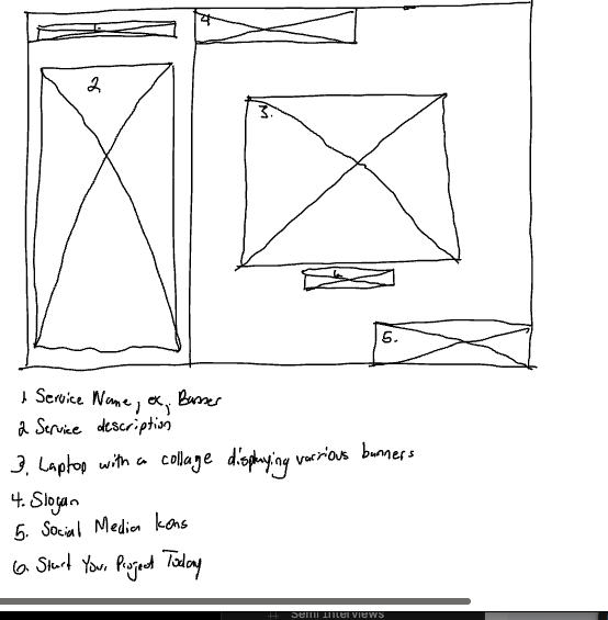
I began with hand‑drawn wireframes to outline the site’s structure. These sketches helped me plan how visitors would move through the header, body, and footer, ensuring a clear flow from navigation to business identity to services and to contact options.
PROTOTYPE & TESTING
Once the prototypes were ready, I tested the site across multiple dimensions. I measured site speed and loading duration to ensure performance was smooth. Responsiveness was checked on desktop, tablet, and mobile devices to confirm that the header, body, and footer adapted seamlessly. I also observed friends navigating through the site, noting how they interacted with the header menu, scrolled through the body content, and used the footer links. Their feedback helped me refine animations, adjust spacing, and simplify navigation labels for clarity.
FINAL SOLUTION & REFLECTION
The redesigned JojiCaptures site strengthened its identity as a freelance creative brand by pairing clear navigation with a modern, responsive UI that highlights services and past work. A structured header, informative body sections, and an accessible footer helped users quickly understand offerings and reach out. Thoughtful typography and hierarchy guided attention to key content, while responsive layouts ensured a smooth experience across devices.
Throughout the project, I focused on user needs, balancing creativity with usability. Moving from sketches to prototypes and testing for clarity, speed, and responsiveness helped refine the final design. Early feedback showed meaningful improvements: clearer navigation, a more professional visual identity, and a noticeably more engaging browsing experience.
The redesign also created measurable value for the business. JojiCaptures saw increased recognition within local creative circles, more inquiries from potential clients, and stronger networking opportunities through shared work and referrals. These outcomes demonstrated how intentional design can elevate even a small freelance brand, helping it stand out and build trust.
This project strengthened essential UX/UI abilities—research, user empathy, visual hierarchy, responsive design, and iterative problem‑solving. These skills directly support the roles and internships I’m pursuing, demonstrating not only my ability to design thoughtful, user‑centered solutions but also my readiness to add value in a professional environment
View Website
IDEATION & DESIGN PROCESS CONT
Once the structure was mapped, I created high‑fidelity prototypes in Figma. This stage allowed me to refine the layout and introduce interactive elements. Social media widgets were added to connect users directly to JojiCaptures, while contact details were placed in both the footer and a dedicated section. Calls‑to‑action such as “Start Your Project” and “View My Work” were positioned to encourage engagement.
The overall design emphasized clean typography and strong hierarchy. Headings highlighted key sections, body text remained simple and readable, and content blocks were arranged logically to showcase services and past projects. Subtle animations like hover effects, smooth scrolling, and transitions gave the site a polished, modern feel while keeping the experience approachable and user‑friendly.
INTRODUCTION
During my internship as a Web Designer at SKY Marketing LLC, I was tasked to redesign Noches To Go, a centralized online ordering platform for multiple Noches de Colombia locations across New Jersey. The goal was to create a responsive, modern website that allowed users to browse menus, select their preferred location, and place orders seamlessly through our ordering platform, SKY Digital Ordering. The redesign needed to elevate the brand’s digital presence, reflect its cultural identity, and deliver an app‑like experience that felt intuitive, fast, and visually engaging.
DEFINING THE PROBLEM
The original Noches To Go website lacked structure, clarity, and essential information, resulting in a weak user experience. It had a bland visual layout, minimal brand identity, and missing details about restaurant locations, services, and partner restaurants. The site also lacked emotional appeal due to limited photography and had poor visual hierarchy, making navigation unclear. The redesign needed to transform the platform into a structured, informative, and visually compelling experience for customers
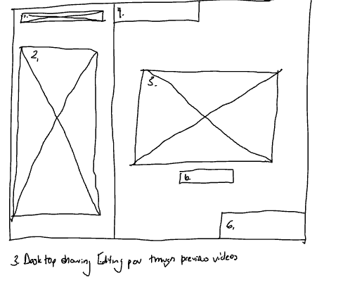
IDEATION & DESIGN PROCESS
I began by creating wireframes for each page, mapping out the header, footer, image placement, typography hierarchy, button layout, and location sections.
PROTOTYPE & TESTING
Once the prototype was complete, I conducted extensive testing across desktop, tablet, and mobile devices to ensure a smooth, app‑like experience. I evaluated navigation flow, button visibility, page load speed, ordering link functionality, and readability without disrupting the user journey.
DEFINING THE PROBLEM
The old site failed to represent Marios Pizza as a professional business. It lacked structure, clarity, and visual appeal. The redesign needed to solve these issues by creating a clean layout, adding navigation elements, incorporating visual content , and presenting information in a way that was easy for customers to understand and engaging enough to draw them in.
RESEARCH & DISCOVERY
I met with my associate to discuss her boyfriend’s goals for the website. Their priorities included a responsive layout, a clear presentation of the business, an appealing UI, and a well-structured menu to showcase food options. We also explored ways to incorporate photos and videos that would capture the restaurant’s atmosphere and enhance visual appeal. In addition to their input, I contributed my own insights and design requirements—focusing on usability, layout clarity, and customer engagement strategies—to elevate the site’s effectiveness. These combined perspectives shaped the project direction and ensured the final design would attract customers while delivering a seamless user experience.
IDEATION & DESIGN PROCESS
I began by creating the initial wireframes , outlining the header, body, and footer to establish the site’s structure. After reviewing these layouts with my associate, I refined the design direction and prepared the visual content, including food photography and environment‑focused video assets.
DEFINING THE PROBLEM
The old site lacked structure and failed to highlight JojiCaptures’ creative identity. Navigation was unclear, the UI was flat, and there were no engaging elements to keep users interested. The redesign aimed to solve these issues by creating a responsive layout with a strong header, informative body content, and a polished footer, all enhanced with animations to guide user attention.
PROJECT NAME
Marios Pizza Website
CONTENT
Website Redesign
YEAR
Sept 2025 - Dec 2025
RESEARCH & DISCOVERY
To begin the project, I met with my boss, Jason, to identify the improvements needed, with the main priority being to enhance the user experience and make the site feel more like a dedicated ordering app. I conducted competitive research by studying well‑known restaurant websites and analyzing how they used typography, visual hierarchy, photography, videography, and layout to guide user behavior. This research helped me understand how successful platforms structure content to improve user flow, reduce friction, and encourage ordering, ultimately shaping the design direction for Noches To Go.
IDEATION & DESIGN PROCESS CONT.
I moved into high‑fidelity prototyping through Duda and incorporated brand colors, food photography, videography, and interactive buttons linking to SKY Ordering. I applied HCI principles ( Human Computer Interaction)—especially emotional design—by including photos of real customers dining, being served, and enjoying meals at various locations to build trust and authenticity. The design emphasized clarity, responsiveness, human emotion, and visual hierarchy to guide users through the site in a natural, intuitive way.
FINAL SOLUTION & REFLECTION
The final Noches To Go website brought together a clean, modern, and cohesive digital presence that made ordering simple across multiple restaurant locations. I focused on intuitive navigation, strong visual hierarchy, and clear “Order Now” pathways, supported by a fully responsive layout that aligned with real user behavior—mobile users accounted for 87% of all visits and 86% of page views, making mobile‑first design essential to the platform’s success.
As you review this case study, you’ll see how the redesign translated directly into stronger engagement. The homepage reached 3160 views with an average time on page of 2 minutes and 40 seconds, while the “Our Locations” page saw 2845 views with similarly strong engagement. Internal navigation performed especially well, generating 415 page views with a bounce rate of just 20.22%, compared to over 55% on search traffic and 61% on direct traffic. Across the week, users generated 2362 total visits, 3160 page views, 9 click‑to‑call interactions, and more than 2400 newsletter impressions—clear signs that the refined layout and interaction patterns encouraged deeper exploration and more meaningful actions.
This project strengthened my ability to design scalable, multi‑location systems and translate business goals into user‑centered digital experiences. And this is exactly where I can support you: by simplifying complex flows, improving conversion through thoughtful UX, and building digital platforms that help your business grow. Whether you’re expanding an ordering system, improving customer engagement, or elevating a brand’s online presence, I bring a design approach that creates experiences users love—and delivers measurable results that move your business forward.
View Website
PROJECT NAME
JojiCaptures Website
CONTENT
Website Redesign
YEAR
Sept 2025 - Nov 2025


Marios Pizza Website
JojiCaptures Website
JojiCaptures Website
Noches To Go Website
JojiCaptures Service Ad
INTRODUCTION
JojiCaptures is my freelance creative agency focused on designing logos, banners, videos, and websites for entrepreneurs and businesses. The original website was basic, unresponsive, and lacked an appealing user interface, which made it difficult to attract potential clients. My goal was to redesign the site so that it not only looked professional but also communicated the value of my services clearly and engaged users to start their projects

RESEARCH & DISCOVERY
To understand what users wanted from the site, I began by researching competitor websites and analyzing how successful creative agencies presented themselves online. I also asked peers and past clients what they expected to see when visiting a creative portfolio site. Their feedback revealed that users wanted clarity about services offered, examples of past projects, and a simple way to get started on their own project. This research guided me to focus on user needs such as responsive design, strong visual hierarchy, and clear calls to action. By putting myself in the client’s shoes, I was able to identify the gaps in my original site and set a direction for the redesign.
WHAT IS JOJICAPTURES?
SERVICES SPECIFIED
USER EXPECTATIONS
TARGET AUDIENCE?
DEFINING THE PROBLEM
The old site lacked structure and failed to highlight JojiCaptures’ creative identity. Navigation was unclear, the UI was flat, and there were no engaging elements to keep users interested. The redesign aimed to solve these issues by creating a responsive layout with a strong header, informative body content, and a polished footer, all enhanced with animations to guide user attention.
IDEATION & DESIGN PROCESS
I began with hand‑drawn wireframes to outline the site’s structure. These sketches helped me plan how visitors would move through the header, body, and footer, ensuring a clear flow from navigation to business identity to services and to contact options.
Once the structure was mapped, I created high‑fidelity prototypes in Figma. This stage allowed me to refine the layout and introduce interactive elements. Social media widgets were added to connect users directly to JojiCaptures, while contact details were placed in both the footer and a dedicated section. Calls‑to‑action such as “Start Your Project” and “View My Work” were positioned to encourage engagement.
The overall design emphasized clean typography and strong hierarchy. Headings highlighted key sections, body text remained simple and readable, and content blocks were arranged logically to showcase services and past projects. Subtle animations like hover effects, smooth scrolling, and transitions gave the site a polished, modern feel while keeping the experience approachable and user‑friendly.
PROTOTYPE & TESTING
Once the prototypes were ready, I tested the site across multiple dimensions. I measured site speed and loading duration to ensure performance was smooth. Responsiveness was checked on desktop, tablet, and mobile devices to confirm that the header, body, and footer adapted seamlessly. I also observed friends navigating through the site, noting how they interacted with the header menu, scrolled through the body content, and used the footer links. Their feedback helped me refine animations, adjust spacing, and simplify navigation labels for clarity.
FINAL SOLUTION & REFLECTION
The redesigned JojiCaptures site strengthened its identity as a freelance creative brand by pairing clear navigation with a modern, responsive UI that highlights services and past work. A structured header, informative body sections, and an accessible footer helped users quickly understand offerings and reach out. Thoughtful typography and hierarchy guided attention to key content, while responsive layouts ensured a smooth experience across devices.
Throughout the project, I focused on user needs, balancing creativity with usability. Moving from sketches to prototypes and testing for clarity, speed, and responsiveness helped refine the final design. Early feedback showed meaningful improvements: clearer navigation, a more professional visual identity, and a noticeably more engaging browsing experience.
The redesign also created measurable value for the business. JojiCaptures saw increased recognition within local creative circles, more inquiries from potential clients, and stronger networking opportunities through shared work and referrals. These outcomes demonstrated how intentional design can elevate even a small freelance brand, helping it stand out and build trust.
This project strengthened essential UX/UI abilities—research, user empathy, visual hierarchy, responsive design, and iterative problem‑solving. These skills directly support the roles and internships I’m pursuing, demonstrating not only my ability to design thoughtful, user‑centered solutions but also my readiness to add value in a professional environment
View Website
Task Flows and Task Analysis
To solve the design challenge, you compiled a set of design needs. The solution needs to meet the needs of users such as flexibility, easier search,...
Wireframe - Prototype - Mockup
In this part, developed to find any screen components that are missing. Before going on to the high resolution mockups, the screens were built digitally and prototyped to conduct cognitive walkthrough testing and to restate the design.
Learning - Reflection - Next Step
In this section you should mention:
- What did you and your team learn from the problem solving process ?
- What you have learned ?
- Summarise the challenges you overcame, the company and the product
- What you plan to do in the future and what you have to improve during the last project ?
Usability Tests
In the user test insight section, you should pay attention to sections such as:
- Do users find it difficult to use the product or service ?
- Problems occurring during testing
- Why do these problems happen ?
- ...
Based on feedback and insight to create edits that match the wishes and desires of users
Summary of the solution after the second re-design:
- How to fix the problem in the second time ?
- What is the effect of second solution redesign ?
- Are the results consistent with the set goals ?
- ...
PROTOTYPE & TESTING
Once the prototypes were ready, I tested the site across multiple dimensions. I measured site speed and loading duration to ensure performance was smooth. Responsiveness was checked on desktop, tablet, and mobile devices to confirm that the header, body, and footer adapted seamlessly. I also observed friends navigating through the site, noting how they interacted with the header menu, scrolled through the body content, and used the footer links. Their feedback helped me refine animations, adjust spacing, and simplify navigation labels for clarity.
FINAL SOLUTION & REFLECTION
The redesigned JojiCaptures site strengthened its identity as a freelance creative brand by pairing clear navigation with a modern, responsive UI that highlights services and past work. A structured header, informative body sections, and an accessible footer helped users quickly understand offerings and reach out. Thoughtful typography and hierarchy guided attention to key content, while responsive layouts ensured a smooth experience across devices.
Throughout the project, I focused on user needs, balancing creativity with usability. Moving from sketches to prototypes and testing for clarity, speed, and responsiveness helped refine the final design. Early feedback showed meaningful improvements: clearer navigation, a more professional visual identity, and a noticeably more engaging browsing experience.
The redesign also created measurable value for the business. JojiCaptures saw increased recognition within local creative circles, more inquiries from potential clients, and stronger networking opportunities through shared work and referrals. These outcomes demonstrated how intentional design can elevate even a small freelance brand, helping it stand out and build trust.
This project strengthened essential UX/UI abilities—research, user empathy, visual hierarchy, responsive design, and iterative problem‑solving. These skills directly support the roles and internships I’m pursuing, demonstrating not only my ability to design thoughtful, user‑centered solutions but also my readiness to add value in a professional environment
View Website
Marios Pizza Website
JojiCaptures Website
JojiCaptures Website
Noches To Go Website
JojiCaptures Service Ad
Lady Doctor MD
Marios Pizza Website
JojiCaptures Website
Noches To Go Website
JojiCaptures Service Ad
Lady Doctor MD
PROJECT NAME
Lady Doctor MD Logo
CONTENT
Logo Creation
YEAR
Jan 2026
Marios Pizza Website
JojiCaptures Website
Noches To Go Website
JojiCaptures Service Ad
Marios Pizza Website
JojiCaptures Website
Noches To Go Website
JojiCaptures Service Ad
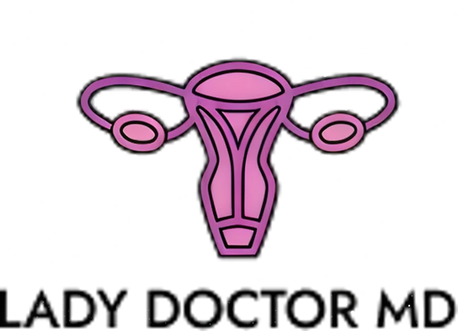
INTRODUCTION
Lady Doctor MD is a medical practice dedicated to providing personalized, high-quality gynecological care. The objective was to create a visual identity that feels both authoritative and accessible, moving away from the sterile, cold aesthetic often associated with traditional clinical branding.
DEFINING THE PROBLEM
The client required a modern digital identity specifically designed to target and resonate with a female audience while moving away from sterile medical clichés. She wanted a brand that felt unapologetically feminine and professional, serving as a visual "safe space" that signaled comfort and inclusivity to all her clients. The goal was to create a visual identity that immediately communicated her specialty to a digital-first demographic, balancing a welcoming, supportive aesthetic with the authority of a board-certified physician.
RESEARCH & DISCOVERY
To understand the current landscape of medical branding, I conducted extensive research using platforms like Pinterest to analyze how modern healthcare logos present themselves. My research revealed a shift toward lifestyle-oriented designs that prioritize patient comfort. A key discovery during this phase was the client’s specific desire to include a stylized uterus symbol; she viewed this anatomical clarity as a way to symbolize transparency, deep specialization, and the professional trust she builds with her patients.

IDEATION & DESIGN PROCESS
The design process focused on transforming the uterus into a clean, iconic emblem that felt modern rather than clinical. To align with the client’s vision, I incorporated her business colors of pink and purple into the icon, creating a custom gradient to blend them seamlessly. I also explored and tested various typography styles, focusing on clean, professional fonts that clearly displayed the brand name while maintaining a high-end feel. The goal was to find a typeface that felt modern and legible, ensuring the "MD" suffix carried the necessary weight of her medical credentials.

LADY DOCTOR MD
LADY DOCTOR MD
LADY DOCTOR MD
LADY DOCTOR MD
FINAL SOLUTION & REFELECTION
I presented the final design to the client by explaining the strategic thought process behind the anatomical symbolism and typographic hierarchy. With the client feedback, we were able to deliver a cohesive identity that spans all her professional materials, securing her enthusiastic approval. This project taught me to take initiative and act as a proactive problem solver by translating direct client feedback into high-value visual solutions. This ability to combine research-backed strategy with creative execution is a significant asset to any branding team, as it helps businesses differentiate themselves in a crowded market, establish immediate credibility, and foster the long-term recognition necessary to drive client loyalty and growth.
PROTOTYPING & TESTING
During the testing phase, I applied the logo to various digital and physical mockups to ensure versatility. A primary focus was testing the logo on research paper and medical document mockups, as the client documents and shares research findings with her patients. It was vital that the gradient and fine lines remained crisp and legible on white paper, maintaining a high-end, academic feel for her professional documentation and educational resources.