
Title
Noches To Go
Noches To Go
Industry
UX/UI
UX/UI
Date
Sep 2025- Nov 2025
Sep 2025- Nov 2025
Introduction
During my internship as a Web Designer at SKY Marketing LLC, I was tasked to redesign Noches To Go, a centralized online ordering platform for multiple Noches de Colombia locations across New Jersey. The goal was to create a responsive, modern website that allowed users to browse menus, select their preferred location, and place orders seamlessly through our ordering platform, SKY Digital Ordering. The redesign needed to elevate the brand’s digital presence, reflect its cultural identity, and deliver an app‑like experience that felt intuitive, fast, and visually engaging.
Defining The Problem
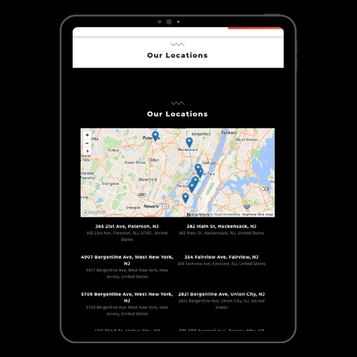
The original Noches To Go website lacked structure, responsiveness , clarity, and essential information, resulting in a weak user experience. It had a bland visual layout, minimal brand identity, and missing details about restaurant locations, services, and partner restaurants. The site also lacked emotional appeal due to limited photography and had poor visual hierarchy, making navigation unclear. The redesign needed to transform the platform into a structured, informative, and visually compelling experience for customers
The original Noches To Go website lacked structure, responsiveness , clarity, and essential information, resulting in a weak user experience. It had a bland visual layout, minimal brand identity, and missing details about restaurant locations, services, and partner restaurants. The site also lacked emotional appeal due to limited photography and had poor visual hierarchy, making navigation unclear. The redesign needed to transform the platform into a structured, informative, and visually compelling experience for customers



Research & Discovery
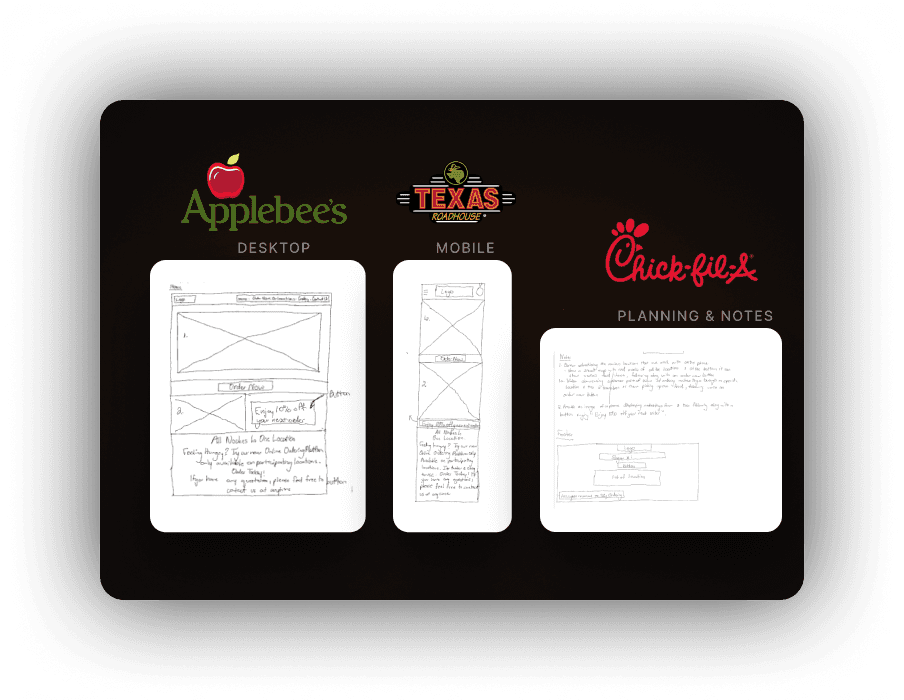
I met with my boss to prioritize enhancing user experience and creating an app-like ordering platform. I conducted competitive research analyzing Applebee's, Texas Roadhouse, and Chick-fil-A, studying their menu layouts, color usage, spacing, and how they guided users through ordering. This helped me understand how successful platforms structure content to reduce friction and encourage ordering, ultimately shaping the design direction for Noches To Go. With a clear direction in place, I began wireframing each page, mapping out the header, footer, image placement, typography hierarchy, button layout, and location sections.
Key findings:
Successful platforms use bold color and clear spacing to guide navigation and establish brand identity
Strategic menu layout with clear categorization reduces decision fatigue
Visual hierarchy effectively guides users from location selection to ordering


Research & Discovery
I met with my boss to prioritize enhancing user experience and creating an app-like ordering platform. I conducted competitive research analyzing Applebee's, Texas Roadhouse, and Chick-fil-A, studying their menu layouts, color usage, spacing, and how they guided users through ordering. This helped me understand how successful platforms structure content to reduce friction and encourage ordering, ultimately shaping the design direction for Noches To Go. With a clear direction in place, I began wireframing each page, mapping out the header, footer, image placement, typography hierarchy, button layout, and location sections.
Key findings:
Successful platforms use bold color and clear spacing to guide navigation and establish brand identity
Strategic menu layout with clear categorization reduces decision fatigue
Visual hierarchy effectively guides users from location selection to ordering
Ideation & Design Process
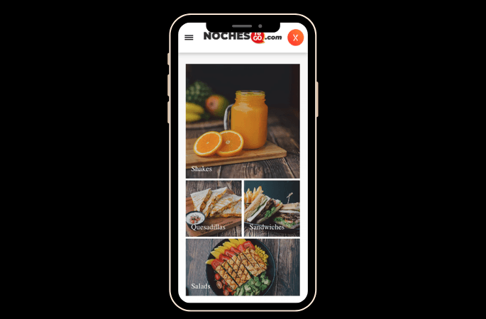
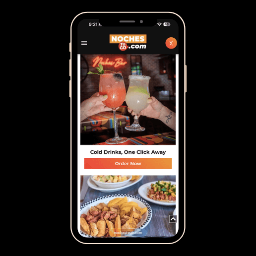
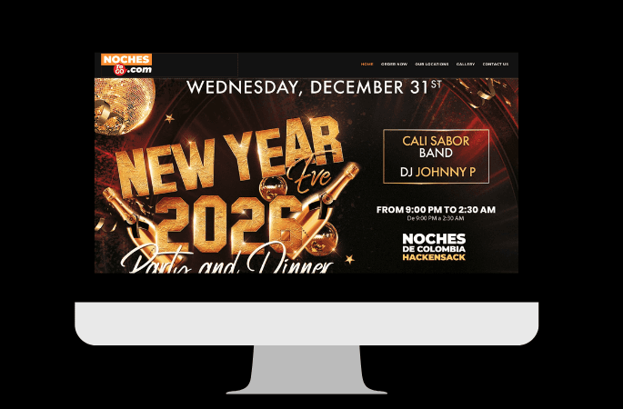
I created high-fidelity prototypes in Figma and built the website in Duda, applying UX/UI and HCI principles throughout the design process. I incorporated brand colors, high-quality food photography and videography, real customer photos, and interactive buttons linking to SKY Ordering.
Design execution included:
Used cohesive brand colors and imagery to establish immediate brand recognition
Incorporated real customer photography and cultural storytelling to build trust and emotional connection
Applied typography and spacing to guide users naturally through location selection to ordering
Optimized for mobile-first experience to deliver app-like functionality
I created high-fidelity prototypes in Figma and built the website in Duda, applying UX/UI and HCI principles throughout the design process. I incorporated brand colors, high-quality food photography and videography, real customer photos, and interactive buttons linking to SKY Ordering.
Design execution included:
Used cohesive brand colors and imagery to establish immediate brand recognition
Incorporated real customer photography and cultural storytelling to build trust and emotional connection
Applied typography and spacing to guide users naturally through location selection to ordering
Optimized for mobile-first experience to deliver app-like functionality




Prototyping & Testing
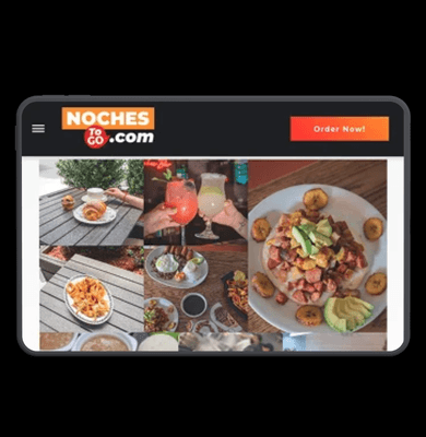
I tested the platform across desktop, tablet, and mobile to ensure a seamless, app-like experience. I evaluated critical user journey touchpoints and refined the design based on findings.
Testing process included:
Tested responsiveness across all device sizes for seamless experience
Evaluated navigation flow to confirm intuitive user movement through the platform
Verified button visibility and readability throughout the user journey
Optimized page load speed for mobile users
Verified ordering platform links and interactive elements functioned correctly
Organized menus and location structure to simplify decision-making
I tested the platform across desktop, tablet, and mobile to ensure a seamless, app-like experience. I evaluated critical user journey touchpoints and refined the design based on findings.
Testing process included:
Tested responsiveness across all device sizes for seamless experience
Evaluated navigation flow to confirm intuitive user movement through the platform
Verified button visibility and readability throughout the user journey
Optimized page load speed for mobile users
Verified ordering platform links and interactive elements functioned correctly
Organized menus and location structure to simplify decision-making


Final Solution & Reflection
The Noches To Go redesign applied UX/UI and HCI principles to deliver a clean, modern, and cohesive digital experience that simplified ordering across multiple restaurant locations. By conducting competitive research, mapping user journeys, and iterating through wireframes and usability testing, the platform was optimized around real user behavior and mobile-first design as well as being aligned with industry standards.
Performance metrics:
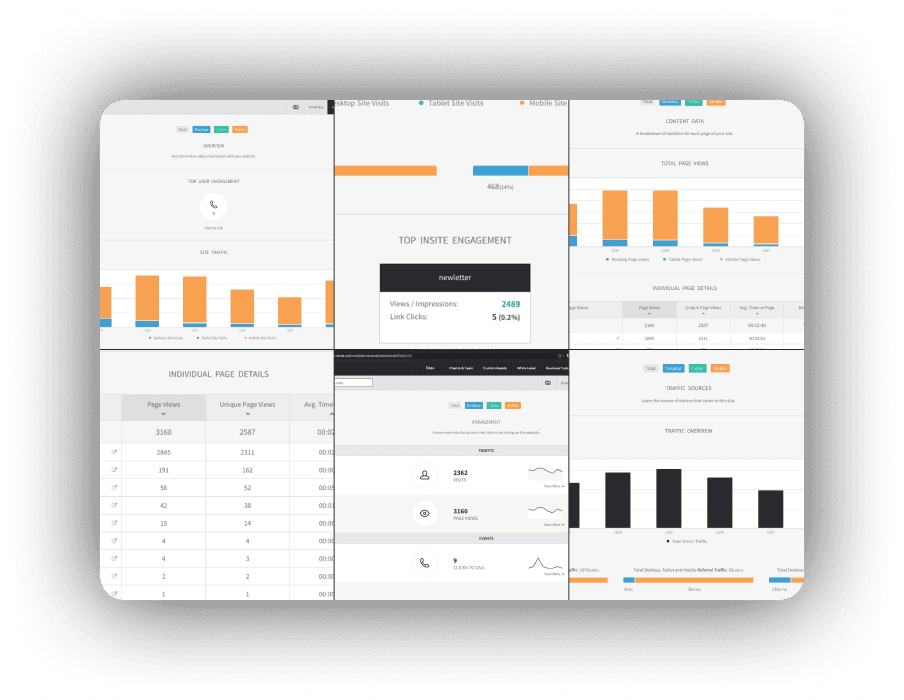
Total Visits: 2,362 visits to the platform
User Engagement: 3,160 homepage views averaging 2 minutes 40 seconds on page
Conversions: 9 click-to-call interactions representing direct customer inquiries
Brand Engagement: Over 2,400 impressions
Mobile Traffic: 87% of all visits
This project demonstrates my ability to translate research and HCI principles into measurable business outcomes, exactly the kind of strategic, data-informed design thinking that drives value in any UX/UI role
The Noches To Go redesign applied UX/UI and HCI principles to deliver a clean, modern, and cohesive digital experience that simplified ordering across multiple restaurant locations. By conducting competitive research, mapping user journeys, and iterating through wireframes and usability testing, the platform was optimized around real user behavior and mobile-first design as well as being aligned with industry standards.
Performance metrics:
Total Visits: 2,362 visits to the platform
User Engagement: 3,160 homepage views averaging 2 minutes 40 seconds on page
Conversions: 9 click-to-call interactions representing direct customer inquiries
Brand Engagement: Over 2,400 impressions
Mobile Traffic: 87% of all visits
This project demonstrates my ability to translate research and HCI principles into measurable business outcomes, exactly the kind of strategic, data-informed design thinking that drives value in any UX/UI role

See the Site in Action
Watch to see how the redesigned Noches To Go experience comes to life — from intuitive navigation to seamless ordering across every screen.
Introduction
During my internship as a Web Designer at SKY Marketing LLC, I was tasked to redesign Noches To Go, a centralized online ordering platform for multiple Noches de Colombia locations across New Jersey. The goal was to create a responsive, modern website that allowed users to browse menus, select their preferred location, and place orders seamlessly through our ordering platform, SKY Digital Ordering. The redesign needed to elevate the brand’s digital presence, reflect its cultural identity, and deliver an app‑like experience that felt intuitive, fast, and visually engaging.
See the Site in Action
Watch how the redesigned Noches To Go experience comes to life — from intuitive navigation to seamless ordering across every screen.
Explore more like this one


Projects
Explore more like this one
Explore more like this one
Selected projects that reflect my approach to design, development, and execution.
Selected projects that reflect my approach to design, development, and execution.