Lady Doctor MD
Lady Doctor MD
Lady Doctor MD
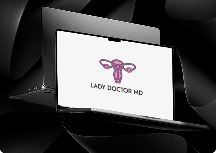
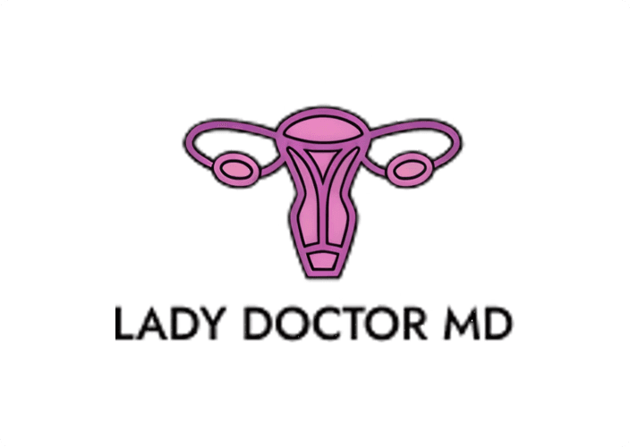
Designed a distinctive brand identity and logo for a gynecology practice, developing a mark that balances approachability and professionalism while clearly communicating the client's values and target audience.
Title
Lady Doctor MD
Lady Doctor MD
Industry
Logo Design
Logo Design
Date
Jan 2026
Jan 2026
Introduction
Lady Doctor MD is a medical practice dedicated to providing personalized, high-quality gynecological care. The objective was to create a visual identity that feels both authoritative and accessible, moving away from the sterile, cold aesthetic often associated with traditional clinical branding.
Defining The Problem
The client required a modern digital identity specifically designed to target and resonate with a female audience while moving away from sterile medical clichés. She wanted a brand that felt unapologetically feminine and professional, serving as a visual "safe space" that signaled comfort and inclusivity to all her clients. The goal was to create a visual identity that immediately communicated her specialty to a digital-first demographic, balancing a welcoming, supportive aesthetic with the authority of a board-certified physician.
The client required a modern digital identity specifically designed to target and resonate with a female audience while moving away from sterile medical clichés. She wanted a brand that felt unapologetically feminine and professional, serving as a visual "safe space" that signaled comfort and inclusivity to all her clients. The goal was to create a visual identity that immediately communicated her specialty to a digital-first demographic, balancing a welcoming, supportive aesthetic with the authority of a board-certified physician.

Research & Discovery
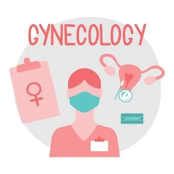
To understand the current landscape of medical branding, I conducted extensive research using platforms like Pinterest to analyze how modern healthcare logos present themselves. My research revealed a shift toward lifestyle-oriented designs that prioritize patient comfort. A key discovery during this phase was the client’s specific desire to include a stylized uterus symbol; she viewed this anatomical clarity as a way to symbolize transparency, deep specialization, and the professional trust she builds with her patients.
Research & Discovery
To understand the current landscape of medical branding, I conducted extensive research using platforms like Pinterest to analyze how modern healthcare logos present themselves. My research revealed a shift toward lifestyle-oriented designs that prioritize patient comfort. A key discovery during this phase was the client’s specific desire to include a stylized uterus symbol; she viewed this anatomical clarity as a way to symbolize transparency, deep specialization, and the professional trust she builds with her patients.
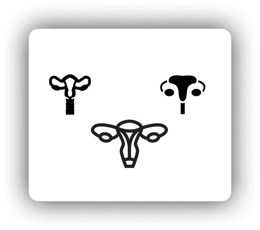
Ideation & Design Process
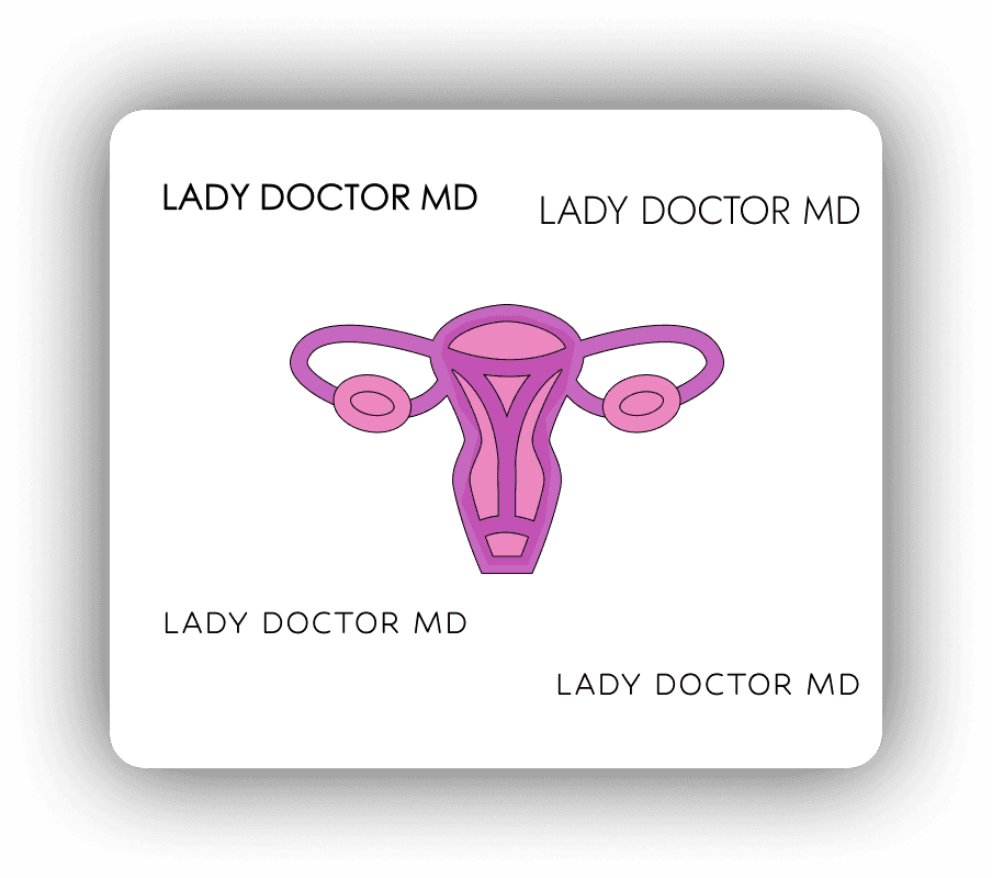
The design process focused on transforming the uterus into a clean, iconic emblem that felt modern rather than clinical. To align with the client’s vision, I incorporated her business colors of pink and purple into the icon, creating a custom gradient to blend them seamlessly. I also explored and tested various typography styles, focusing on clean, professional fonts that clearly displayed the brand name while maintaining a high-end feel. The goal was to find a typeface that felt modern and legible, ensuring the "MD" suffix carried the necessary weight of her medical credentials.
The design process focused on transforming the uterus into a clean, iconic emblem that felt modern rather than clinical. To align with the client’s vision, I incorporated her business colors of pink and purple into the icon, creating a custom gradient to blend them seamlessly. I also explored and tested various typography styles, focusing on clean, professional fonts that clearly displayed the brand name while maintaining a high-end feel. The goal was to find a typeface that felt modern and legible, ensuring the "MD" suffix carried the necessary weight of her medical credentials.
Prototyping & Testing
During the testing phase, I applied the logo to various digital and physical mockups to ensure versatility. A primary focus was testing the logo on research paper and medical document mockups, as the client documents and shares research findings with her patients. It was vital that the gradient and fine lines remained crisp and legible on white paper, maintaining a high-end, academic feel for her professional documentation and educational resources.
During the testing phase, I applied the logo to various digital and physical mockups to ensure versatility. A primary focus was testing the logo on research paper and medical document mockups, as the client documents and shares research findings with her patients. It was vital that the gradient and fine lines remained crisp and legible on white paper, maintaining a high-end, academic feel for her professional documentation and educational resources.
Final Solution & Reflection
I presented the final design to the client by explaining the strategic thought process behind the anatomical symbolism and typographic hierarchy. With the client feedback, we were able to deliver a cohesive identity that spans all her professional materials, securing her enthusiastic approval. This project taught me to take initiative and act as a proactive problem solver by translating direct client feedback into high-value visual solutions. This ability to combine research-backed strategy with creative execution is a significant asset to any branding team, as it helps businesses differentiate themselves in a crowded market, establish immediate credibility, and foster the long-term recognition necessary to drive client loyalty and growth.
I presented the final design to the client by explaining the strategic thought process behind the anatomical symbolism and typographic hierarchy. With the client feedback, we were able to deliver a cohesive identity that spans all her professional materials, securing her enthusiastic approval. This project taught me to take initiative and act as a proactive problem solver by translating direct client feedback into high-value visual solutions. This ability to combine research-backed strategy with creative execution is a significant asset to any branding team, as it helps businesses differentiate themselves in a crowded market, establish immediate credibility, and foster the long-term recognition necessary to drive client loyalty and growth.
Introduction
Lady Doctor MD is a medical practice dedicated to providing personalized, high-quality gynecological care. The objective was to create a visual identity that feels both authoritative and accessible, moving away from the sterile, cold aesthetic often associated with traditional clinical branding.
Projects
Explore more like this one
Explore more like this one
Selected projects that reflect my approach to design, development, and execution.