Find My Doctor Calendar Widgets
Find My Doctor Calendar Widgets
Optimized the appointment booking experience by designing multiple calendar widget variations for the Find a Doctor feature. Through strategic color hierarchy, responsive design, and collaborative approach with product managers and developers, I created variations that reduce friction in scheduling and guide users toward booking with clear visual engagement states. The variations are positioned for future A/B testing to measure impact on patient conversion rates and booking completion.

Title
Find My Doctor Calender Widgets
Industry
UX/UI Design
Date
June 2026 - August 2026
June 2026 - August 2026

Introduction
As my first major project during my internship at Atlantic Health, I was tasked with redesigning the calendar widget for the Find a Doctor page. Although the current booking experience was functioning and appointments were being scheduled, the primary focus was elevating provider availability visibility. Through effective collaboration with product managers and developers, I worked to make it obvious that providers had open slots and empower patients to book with confidence. Patients needed to see availability clearly and immediately, yet the existing design obscured this information behind unclear interfaces. This lack of visibility impacted patient engagement and accessibility across all demographics. I set out to design calendar widget variations that would transform provider availability into the hero of the interface and increase patient bookings.
Introduction
As my first major project during my internship at Atlantic Health, I was tasked with redesigning the calendar widget for the Find a Doctor page. Although the current booking experience was functioning and appointments were being scheduled, the primary focus was elevating provider availability visibility. Through effective collaboration with product managers and developers, I worked to make it obvious that providers had open slots and empower patients to book with confidence. Patients needed to see availability clearly and immediately, yet the existing design obscured this information behind unclear interfaces. This lack of visibility impacted patient engagement and accessibility across all demographics. I set out to design calendar widget variations that would transform provider availability into the hero of the interface and increase patient bookings.
Defining the Problem
Before designing, I partnered directly with the product and development teams to develop a shared understanding of the challenge. Their primary focus was creating a calendar widget that displayed meaningful availability—not empty date slots, but actual times patients could book. Through collaborative discussion, we aligned on the following requirements:
Show 5 dates with earliest available times and subsequent availability based on provider schedules
Present this information in a compact widget format without overwhelming users
Reveal availability progressively—showing essential information at first glance with ability to explore deeper when needed
Enable patients to see actual booking slots, not empty date placeholders
The challenge was presenting this amount of information clearly while managing information density in a limited interface space.
Before designing, I partnered directly with the product and development teams to develop a shared understanding of the challenge. Their primary focus was creating a calendar widget that displayed meaningful availability—not empty date slots, but actual times patients could book. Through collaborative discussion, we aligned on the following requirements:
Show 5 dates with earliest available times and subsequent availability based on provider schedules
Present this information in a compact widget format without overwhelming users
Reveal availability progressively—showing essential information at first glance with ability to explore deeper when needed
Enable patients to see actual booking slots, not empty date placeholders
The challenge was presenting this amount of information clearly while managing information density in a limited interface space.
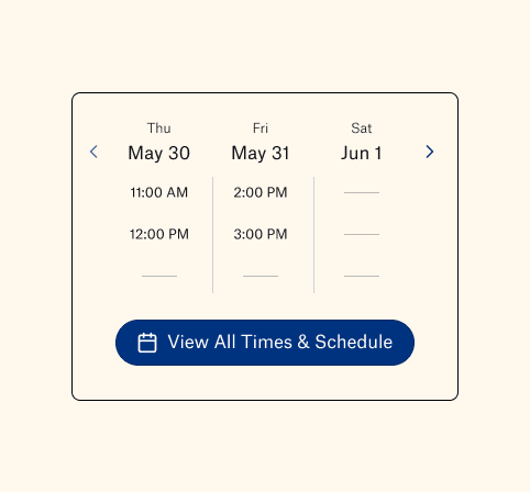

Research & Discovery
I conducted competitive analysis across leading healthcare platforms, with Novant Health emerging as the primary reference point. Their calendar design demonstrated several effective patterns:
Plus/minus functionality for expanding and collapsing the widget
Highlighted time slots indicating available bookings
Arrow navigation enabling users to explore different days of availability
Clear visual distinction between interactive and non-interactive elements
However, I identified a critical limitation in their approach:
Expanded view displayed days with empty time slots, creating confusion about actual availability
Users couldn't quickly distinguish between available and unavailable dates
I recommended to the team that we mimic their interactive expand/collapse functionality but improve the core value proposition by only displaying days with actual available times. This refinement would give patients immediate clarity about when they could book without wading through unavailable dates.
Research & Discovery
I conducted competitive analysis across leading healthcare platforms, with Novant Health emerging as the primary reference point. Their calendar design demonstrated several effective patterns:
Plus/minus functionality for expanding and collapsing the widget
Highlighted time slots indicating available bookings
Arrow navigation enabling users to explore different days of availability
Clear visual distinction between interactive and non-interactive elements
However, I identified a critical limitation in their approach:
Expanded view displayed days with empty time slots, creating confusion about actual availability
Users couldn't quickly distinguish between available and unavailable dates
I recommended to the team that we mimic their interactive expand/collapse functionality but improve the core value proposition by only displaying days with actual available times. This refinement would give patients immediate clarity about when they could book without wading through unavailable dates.
Ideation & Design Process Part 1
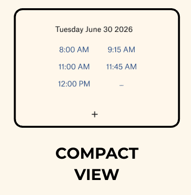
With user research and team alignment established, I moved into Figma to design the calendar widget variations. I collaborated closely with the product and design teams to apply Atlantic Health's design system throughout, ensuring visual and functional consistency. The primary widget design applies progressive disclosure, a UX principle that reveals information gradually rather than overwhelming users with everything at once.
The interaction model includes:
Compact view: One day with 5 available time slots, each highlighted in blue to indicate they are interactive booking options
Plus icon: Expands the widget to show 5 days of availability, each day displaying 5 times based on the selected provider's actual schedule
Extended view: Full week of availability displayed without any empty date slots
Minus icon: Collapses the widget back to the compact view, or users can scroll to explore additional days of availability
This progressive disclosure approach reduces cognitive load while keeping detailed availability accessible when users need it.
With user research and team alignment established, I moved into Figma to design the calendar widget variations. I collaborated closely with the product and design teams to apply Atlantic Health's design system throughout, ensuring visual and functional consistency. The primary widget design applies progressive disclosure, a UX principle that reveals information gradually rather than overwhelming users with everything at once.
The interaction model includes:
Compact view: One day with 5 available time slots, each highlighted in blue to indicate they are interactive booking options
Plus icon: Expands the widget to show 5 days of availability, each day displaying 5 times based on the selected provider's actual schedule
Extended view: Full week of availability displayed without any empty date slots
Minus icon: Collapses the widget back to the compact view, or users can scroll to explore additional days of availability
This progressive disclosure approach reduces cognitive load while keeping detailed availability accessible when users need it.





Ideation & Design Process Part 2
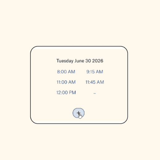
I implemented color hierarchy strategically through button states to enhance the interactive experience. The visual strategy includes:
Passive states: Lighter fill color, communicating lower priority and non-interactive elements
Active engagement states: Darker, more prominent fill through hover interactions, displaying clearer affordances
Visual progression: Guides user attention and communicates interactivity clearly
Cognitive load reduction: Progressive disclosure reduces visual complexity while maintaining access to information
Through iterative feedback with the development team, I refined these hover states to ensure clear visual feedback. Users understood which elements were clickable and their navigation choices were reinforced throughout the booking experience.
I implemented color hierarchy strategically through button states to enhance the interactive experience. The visual strategy includes:
Passive states: Lighter fill color, communicating lower priority and non-interactive elements
Active engagement states: Darker, more prominent fill through hover interactions, displaying clearer affordances
Visual progression: Guides user attention and communicates interactivity clearly
Cognitive load reduction: Progressive disclosure reduces visual complexity while maintaining access to information
Through iterative feedback with the development team, I refined these hover states to ensure clear visual feedback. Users understood which elements were clickable and their navigation choices were reinforced throughout the booking experience.


Prototyping & Testing
Note: The calendar widget design is not currently live on the Atlantic Health website. Testing and validation are planned for the next couple of months on dev2 and stage environments. This represents a demo to increase patient engagement and booking conversion rates
The key focus during prototyping and testing was validating the expanded and unexpanded states and ensuring they displayed correctly across the website. I created a variation where selecting the plus sign transitions the widget from a compact view to an expanded state. Key testing areas included:
Expand/collapse interaction: Smooth transition from compact one-day view to full 5-day expanded state
Provider comparison: Second provider appears directly below expanded calendar, enabling quick comparison without navigation away
Navigation options: Users can select alternate providers, explore different calendars, or collapse back to compact view
Color hierarchy validation: Button styling with fill treatments clearly differentiates passive and engaged states
Cross-platform responsiveness: Tested interaction model and visual communication across responsive breakpoints
User understanding: Validated that users understood each element's function and navigation flows
Note: The calendar widget design is not currently live on the Atlantic Health website. Testing and validation are planned for the next couple of months on dev2 and stage environments. This represents a demo to increase patient engagement and booking conversion rates
The key focus during prototyping and testing was validating the expanded and unexpanded states and ensuring they displayed correctly across the website. I created a variation where selecting the plus sign transitions the widget from a compact view to an expanded state. Key testing areas included:
Expand/collapse interaction: Smooth transition from compact one-day view to full 5-day expanded state
Provider comparison: Second provider appears directly below expanded calendar, enabling quick comparison without navigation away
Navigation options: Users can select alternate providers, explore different calendars, or collapse back to compact view
Color hierarchy validation: Button styling with fill treatments clearly differentiates passive and engaged states
Cross-platform responsiveness: Tested interaction model and visual communication across responsive breakpoints
User understanding: Validated that users understood each element's function and navigation flows


Final Solution & Reflection
Through effective collaboration with developers, product managers, and design specialists, the calendar widget design was approved. I created a solution that simplifies the user experience by applying progressive disclosure, color hierarchy, and responsive design to showcase provider availability. The widget successfully displays more options, which was the marketing team's core objective, while remaining compact and scannable.
Currently in development, this solution will advance through A/B testing on dev2 and stage Atlantic Health environments to measure impact on patient engagement and booking conversion rates. Every design decision was grounded in patient behavior and stakeholder feedback. This project taught me the importance of cognitive load and conducting competitive analysis in healthcare design. By making provider availability immediately visible and navigation intuitive, we eliminated the friction that prevented patients from booking appointments, ultimately improving overall healthcare accessibility and usability. This project showcases my ability to combine research-driven insights with strategic design execution to create solutions that measurably impact organizational performance and patient outcomes—a key value proposition for healthcare organizations seeking to differentiate through thoughtful digital experiences.
Through effective collaboration with developers, product managers, and design specialists, the calendar widget design was approved. I created a solution that simplifies the user experience by applying progressive disclosure, color hierarchy, and responsive design to showcase provider availability. The widget successfully displays more options, which was the marketing team's core objective, while remaining compact and scannable.
Currently in development, this solution will advance through A/B testing on dev2 and stage Atlantic Health environments to measure impact on patient engagement and booking conversion rates. Every design decision was grounded in patient behavior and stakeholder feedback. This project taught me the importance of cognitive load and conducting competitive analysis in healthcare design. By making provider availability immediately visible and navigation intuitive, we eliminated the friction that prevented patients from booking appointments, ultimately improving overall healthcare accessibility and usability. This project showcases my ability to combine research-driven insights with strategic design execution to create solutions that measurably impact organizational performance and patient outcomes, a key value proposition for healthcare organizations seeking to differentiate through thoughtful digital experiences.
Through effective collaboration with developers, product managers, and design specialists, the calendar widget design was approved. I created a solution that simplifies the user experience by applying progressive disclosure, color hierarchy, and responsive design to showcase provider availability. The widget successfully displays more options, which was the marketing team's core objective, while remaining compact and scannable.
Currently in development, this solution will advance through A/B testing on dev2 and stage Atlantic Health environments to measure impact on patient engagement and booking conversion rates. Every design decision was grounded in patient behavior and stakeholder feedback. This project taught me the importance of cognitive load and conducting competitive analysis in healthcare design. By making provider availability immediately visible and navigation intuitive, we eliminated the friction that prevented patients from booking appointments, ultimately improving overall healthcare accessibility and usability. This project showcases my ability to combine research-driven insights with strategic design execution to create solutions that measurably impact organizational performance and patient outcomes—a key value proposition for healthcare organizations seeking to differentiate through thoughtful digital experiences.
Introduction
As my first major project during my internship at Atlantic Health, I was tasked with redesigning the calendar widget for the Find a Doctor page. Although the current booking experience was functioning and appointments were being scheduled, the primary focus was elevating provider availability visibility. Through effective collaboration with product managers and developers, I worked to make it obvious that providers had open slots and empower patients to book with confidence. Patients needed to see availability clearly and immediately, yet the existing design obscured this information behind unclear interfaces. This lack of visibility impacted patient engagement and accessibility across all demographics. I set out to design calendar widget variations that would transform provider availability into the hero of the interface and increase patient bookings.
Projects
Explore more like this one
Explore more like this one


Selected projects that reflect my approach to design, development, and execution.